Figma has revolutionized the way designers collaborate and create user interfaces. At the heart of Figma's powerful features are components, which can significantly streamline your design process and ensure consistency across projects. In this comprehensive guide, we'll explore the best practices for using Figma components to maximize your productivity and create scalable design systems.
Understanding Figma Components
Before diving into best practices, it's crucial to understand what Figma components are and how they function.
What are Figma Components?
Figma components are reusable design elements that can be instantiated multiple times across your designs. When you update the main component, all instances automatically reflect those changes, ensuring consistency and saving time.
Benefits of Using Components
Consistency across designs
Faster iterations and updates
Improved collaboration
Easier maintenance of design systems
Reduced file size and improved performance
Creating Effective Components
To make the most of Figma components, follow these best practices when creating them:
Start with Atomic Design
Begin by creating components for the smallest, most basic elements of your design system, such as buttons, icons, and form inputs. These atomic components can then be combined to create more complex components.
Use Meaningful Names
Adopt a clear and consistent naming convention for your components. This helps team members quickly find and understand the purpose of each component.
Example: [Category]/[Subcategory]/[ComponentName]/[Variant]
Design for Flexibility
Create components with flexibility in mind. Use constraints and auto-layout to ensure your components can adapt to different content and screen sizes.
Document Your Components
Add descriptions to your components to explain their purpose, usage guidelines, and any specific considerations. This documentation helps other team members use the components correctly.
Organizing Your Components
A well-organized component library is crucial for efficiency and collaboration. Here are some tips for keeping your components organized:
Use Pages for Categories
Create separate pages in your Figma file for different categories of components, such as "Atoms," "Molecules," and "Organisms."
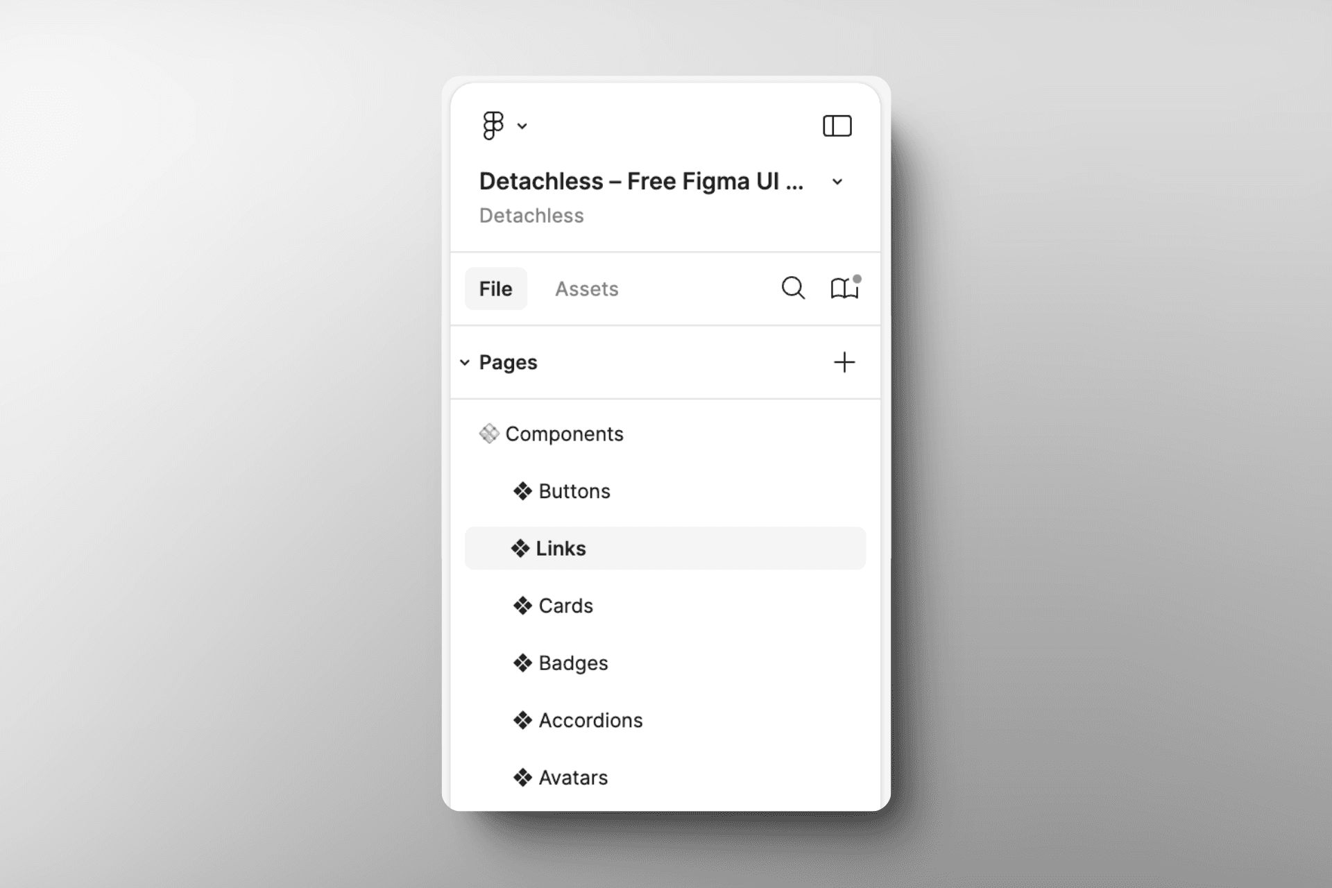
Implement a Folder Structure
Within each page, use folders to further organize components by type or function. This hierarchical structure makes it easier to locate specific components.
Create a Component Overview
Design a "table of contents" frame that showcases all your components at a glance. This helps team members quickly find the components they need.
Maintain Consistency
Ensure that your organizational structure remains consistent across projects and team members. This consistency will save time and reduce confusion in the long run.
Leveraging Variants
Variants are a powerful feature in Figma that allow you to create and manage multiple versions of a component within a single main component.
When to Use Variants
Use variants for components that have different states or variations, such as:
Buttons (primary, secondary, disabled)
Icons (filled, outlined, colored)
Form inputs (default, focused, error)
Organizing Variants
Group related variants together
Use a consistent naming convention for variant properties
Arrange variants in a logical order (e.g., small to large, light to dark)
Utilizing Properties Panel
Take advantage of the Properties panel to define and manage variant properties. This makes it easier for designers to switch between variants in their designs.
Utilizing Component Properties
Component properties allow you to create more flexible and customizable components. Here's how to make the most of this feature:
Identify Customizable Elements
Determine which aspects of your component should be customizable, such as text content, colors, or visibility of certain elements.
Use Meaningful Property Names
Choose clear and descriptive names for your component properties to ensure other designers easily understand them.
Set Default Values
Provide sensible default values for your component properties to make them immediately usable in designs.
Combine with Variants
Use component properties in conjunction with variants to create highly flexible components that can adapt to various design scenarios.
Maintaining Component Libraries
A well-maintained component library is essential for long-term success with Figma components.

Regular Audits
Conduct periodic audits of your component library to:
Remove unused or outdated components
Consolidate similar components
Ensure consistency in naming and organization
Version Control
Implement a version control system for your component library:
Use semantic versioning (e.g., v1.0.0, v1.1.0)
Document changes in each version
Communicate updates to team members
Deprecation Process
Establish a process for deprecating and replacing outdated components:
Mark components as deprecated
Provide migration instructions
Set a timeline for removal
Collaborating with Components
Figma's collaborative features shine when working with components. Here are some best practices for team collaboration:
Shared Libraries
Create and maintain shared component libraries that can be accessed across multiple projects and teams.
Component Requests
Establish a process for team members to request new components or modifications to existing ones.
Review Process
Implement a review process for new components to ensure they meet design standards and are consistent with the existing library.
Documentation and Guidelines
Create comprehensive documentation and usage guidelines for your component library to help team members use components effectively.
Performance Considerations
As your component library grows, it's important to consider performance implications:
Optimize Component Size
Keep your components as small and efficient as possible by:
Removing unnecessary layers
Using vector shapes instead of rasterized images when possible
Avoiding excessive use of effects and complex masks
Smart Use of Instances
Use component instances judiciously to avoid overloading your design files:
Consider using local components for project-specific elements
Break down large components into smaller, more manageable pieces
Regular Performance Checks
Periodically review your Figma file's performance using the built-in performance panel and optimize as needed.
Advanced Component Techniques
Once you've mastered the basics, explore these advanced techniques to take your Figma components to the next level:
Interactive Components
Use Figma's prototyping features to create interactive components that simulate user interactions and transitions.
Auto Layout for Responsive Components
Leverage Auto Layout to create components that automatically adjust to different content lengths and screen sizes.
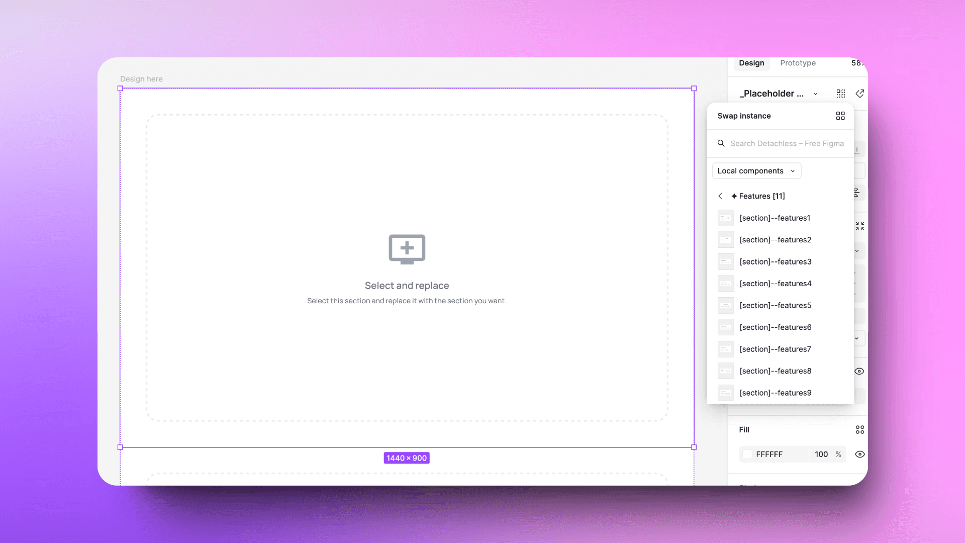
Component Swapping
Utilize component swapping to switch between different components while maintaining overrides and connections easily.
Custom Plugin Integration
Explore Figma plugins that can enhance your component workflow, such as tools for bulk editing or advanced organization.
Practical Examples: Buttons, Links, and Avatars
To illustrate the best practices we've discussed, let's look at some practical examples of how to create and use components for common UI elements: buttons, links, and avatars.
Button Components
Buttons are essential UI elements that benefit greatly from being set up as components with variants and properties.
Creating Button Components:
Start with a basic button shape and text.
Add states as variants (e.g., Default, Hover, Pressed, Disabled).
Use component properties for customization:
Text: For button label
Icon: Boolean to toggle icon visibility
Size: To switch between different button sizes
Variant: To change between primary, secondary, and tertiary styles
Button component example
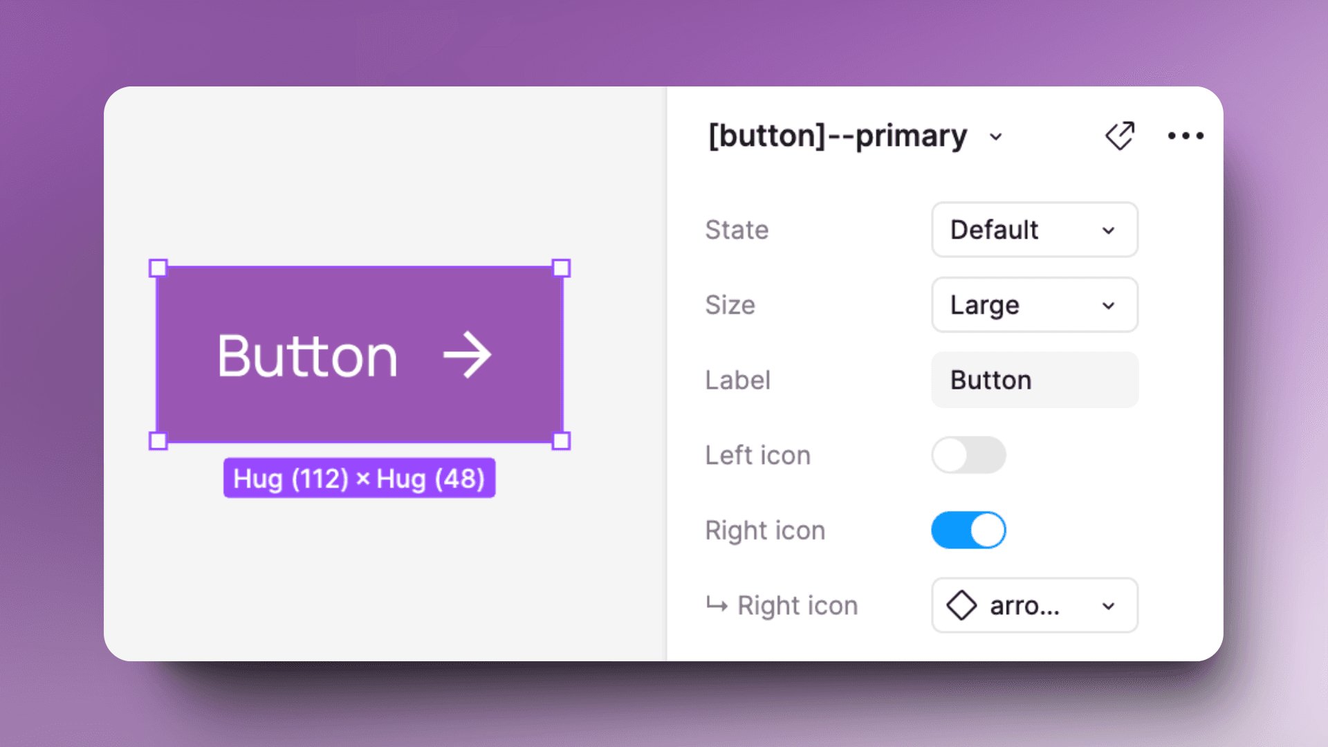
Best Practices for Button Components:
Use auto layout to ensure the button adapts to different text lengths.
Create a consistent padding and spacing system across all button sizes.
Use color styles for easy theming and dark mode adaptation.
Include hover and focus states for accessibility.
Link Components
Links are another crucial element that can be streamlined using Figma components.
Creating Link Components:
Create a text layer for the link.
Add states as variants (Default, Hover, Visited, Active).
Use component properties for customization:
Text: For link content
Underline (Boolean): To toggle underline style
Icon (Boolean): To add an external link icon if needed
Link component example
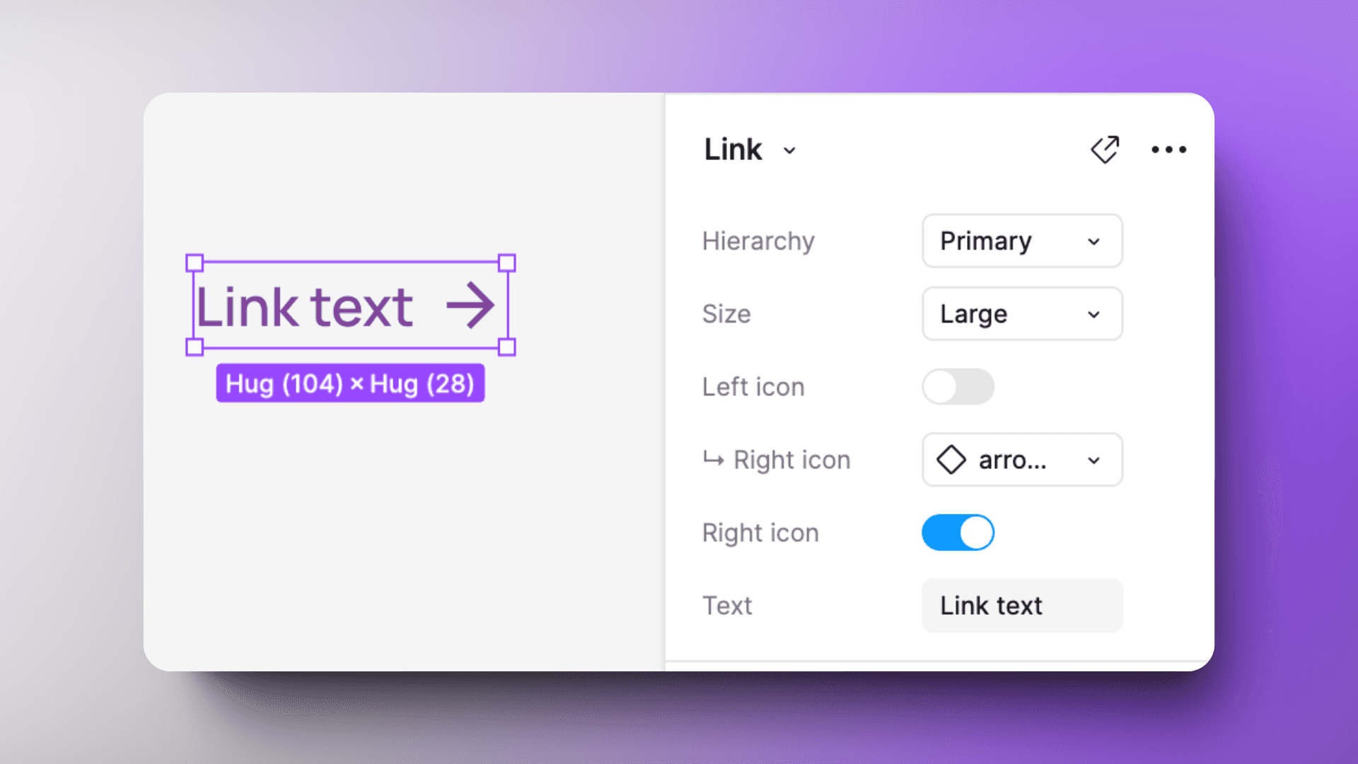
Best Practices for Link Components:
Use text styles to maintain consistency with your typography system.
Ensure sufficient color contrast between link states for accessibility.
Consider creating separate variants for inline links and standalone links.
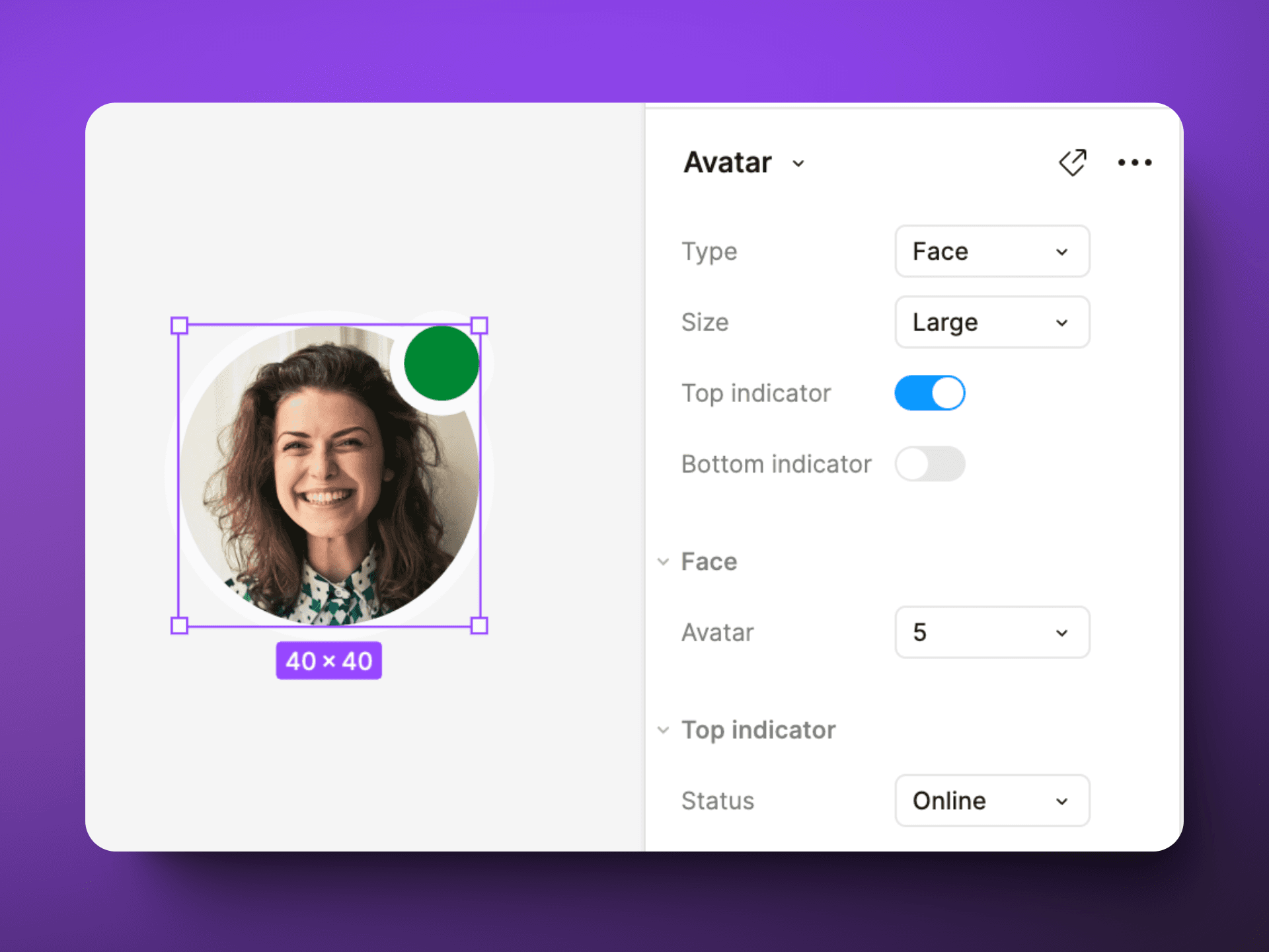
Avatar Components
Avatars are versatile components that can be used to represent users or entities in your UI.
Creating Avatar Components:
Start with a circular shape for the avatar container.
Add variants for different sizes and types (e.g., with image, initials, or icon).
Use component properties for customization:
Image: To swap the avatar image
Initials: For text-based avatars
Status: To add an online/offline indicator
Avatar component example
Best Practices for Avatar Components:
Use masks to ensure images always fit within the circular shape.
Create a consistent sizing system across your avatar variants.
Include fallback options (initials or icons) for when images aren't available.
Consider adding a subtle border or shadow to ensure visibility on various backgrounds.
Conclusion
Mastering Figma components is a game-changer for designers looking to create efficient, consistent, and scalable design systems. By following these best practices, you'll be well-equipped to harness the full power of Figma components in your design workflow.
Remember that becoming proficient with components takes time and practice. Experiment with different approaches, learn from your experiences, and continually refine your component strategy to find what works best for you and your team.
As you implement these best practices, you'll notice significant improvements in your design process, collaboration, and overall productivity. Embrace the power of Figma components, and watch your design workflow transform.
Would you like me to elaborate on any specific section or provide more details on a particular aspect of using Figma components?