A high-converting landing page is more than just a pretty design—it’s a well-structured page that guides visitors toward taking action, whether that’s signing up, purchasing, or contacting your team. Every section plays a crucial role in driving conversions, and when done right, it can significantly improve your success rate. In this article, we’ll break down the 11 must-have sections for a high-converting landing page, all of which can be easily designed in Figma and published with Detachless.
Why Landing Page Structure Matters
The structure of your landing page is one of the most critical factors in its effectiveness. A high-converting landing page is strategically organized to lead visitors through a journey, from capturing their attention with a headline to building trust with social proof, and finally to driving action with a compelling CTA. Each section has a purpose, and when combined, they create a cohesive experience that boosts conversions.
By carefully planning these essential landing page sections, you can ensure that your page is optimized to capture leads and convert visitors. Let’s dive into each section and discuss how to maximize its potential.
Section 1: Compelling Headline
Your headline is the first thing visitors see, and it sets the tone for the rest of your page. A strong headline should be clear, concise, and compelling—focusing on the primary benefit of your product or service. It needs to immediately capture attention and convey the value of what you’re offering.
Example:
Weak Headline: "Welcome to Our Product"
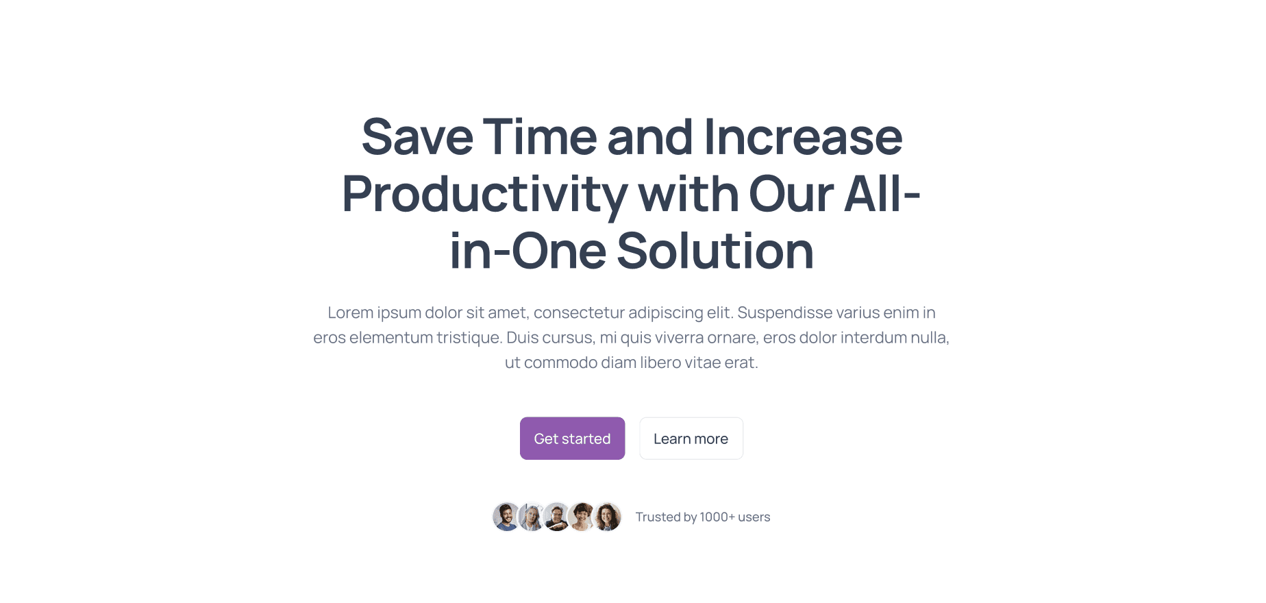
Strong Headline: "Save Time and Increase Productivity with Our All-in-One Solution"
The second headline clearly addresses the visitor’s needs and presents a solution right away.
Section 2: Subheadline or Supporting Text
Directly below the headline, the subheadline provides additional information that supports the main message. It should further clarify the offer and explain how it solves the visitor's problem. Think of it as a way to reinforce the promise made in the headline, but with more detail.
Example:
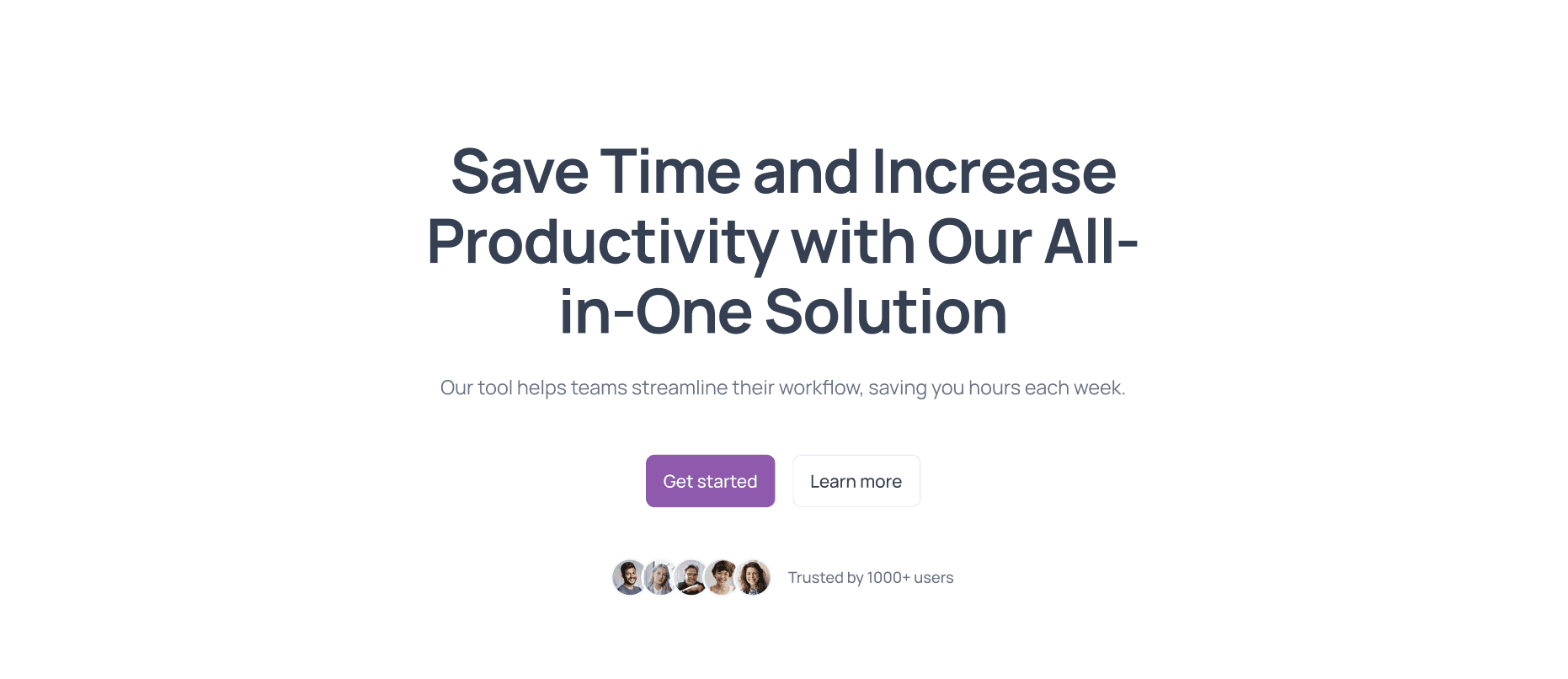
"Our tool helps teams streamline their workflow, saving you hours each week."
Section 3: Hero Image or Video
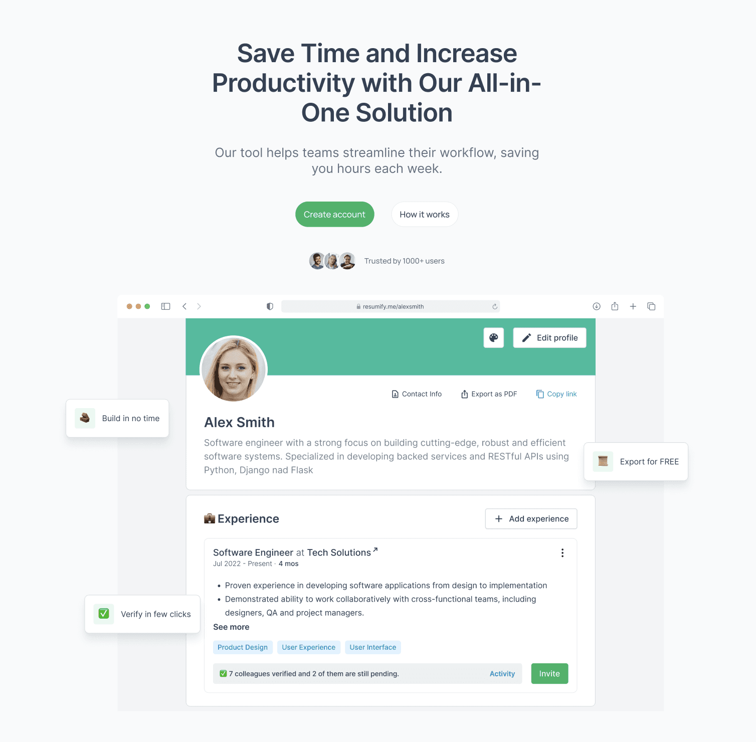
Visual elements are essential for creating an engaging landing page. A hero image or video that complements your headline can help visitors understand your offer at a glance. The visuals should be high-quality and directly related to the product or service you're promoting. If using a video, make sure it’s short, informative, and clearly explains the benefits of your offer.
Tips:
Use images or videos that feature the product in action.
Ensure that visuals load quickly and are optimized for all devices.
Section 4: Benefits Overview
Instead of focusing solely on features, emphasize the benefits your product provides. This section should clearly explain how your product or service improves the user’s life. Benefits are more emotionally resonant and speak directly to what the user cares about—whether it’s saving time, reducing costs, or improving convenience.
Example:
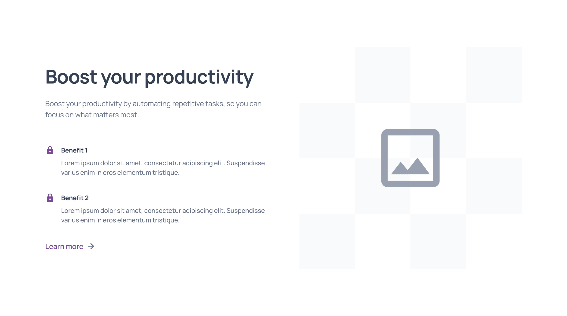
"Boost your productivity by automating repetitive tasks, so you can focus on what matters most."
Section 5: Social Proof and Testimonials
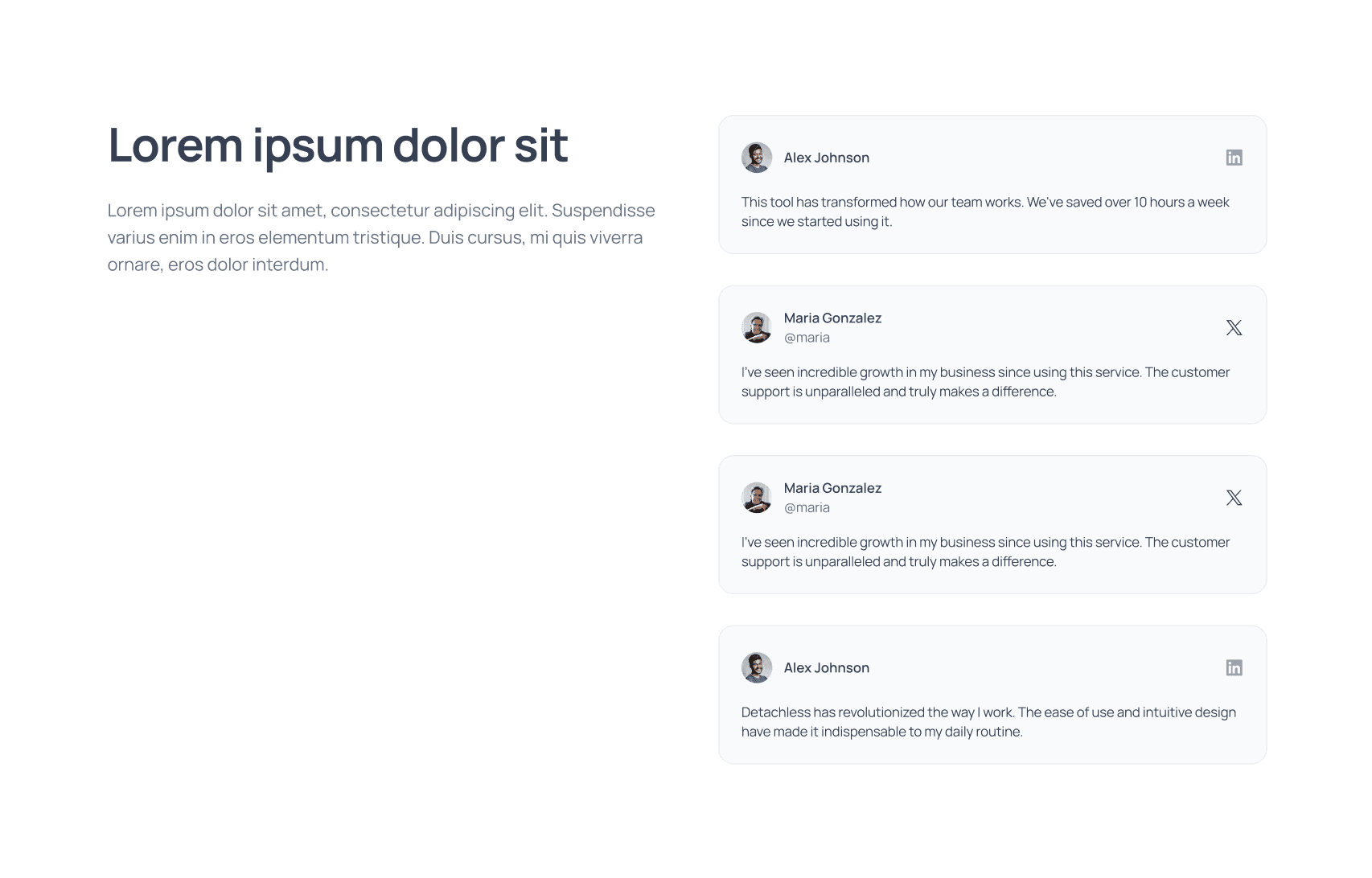
Social proof builds credibility and trust with your visitors. Adding testimonials from satisfied customers or case studies showing tangible results can greatly improve conversion rates. Potential customers want to know that others have had positive experiences with your product or service.
Example:
"This tool has transformed how our team works. We've saved over 10 hours a week since we started using it." – Sarah D., Marketing Manager
Make sure testimonials are genuine, specific, and relevant to your target audience.
Section 6: Clear Call-to-Action (CTA)
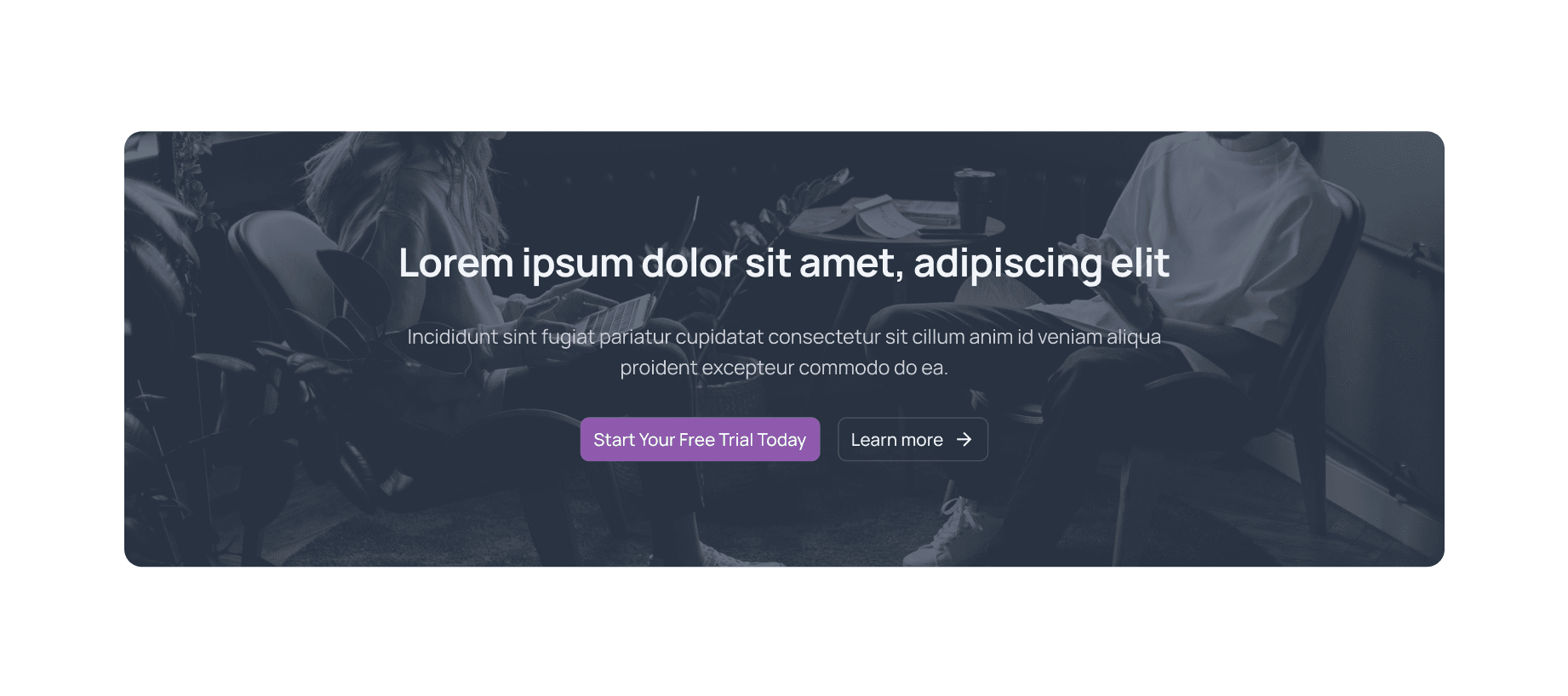
A strong CTA is crucial for conversions. It should stand out visually and use action-oriented language that encourages the user to take the next step, whether that’s signing up for a trial, making a purchase, or scheduling a demo.
Example:
"Start Your Free Trial Today"
"Get Instant Access Now"
Ensure the CTA is repeated in key areas of the landing page and is designed to be easy to spot.
Section 7: Features List
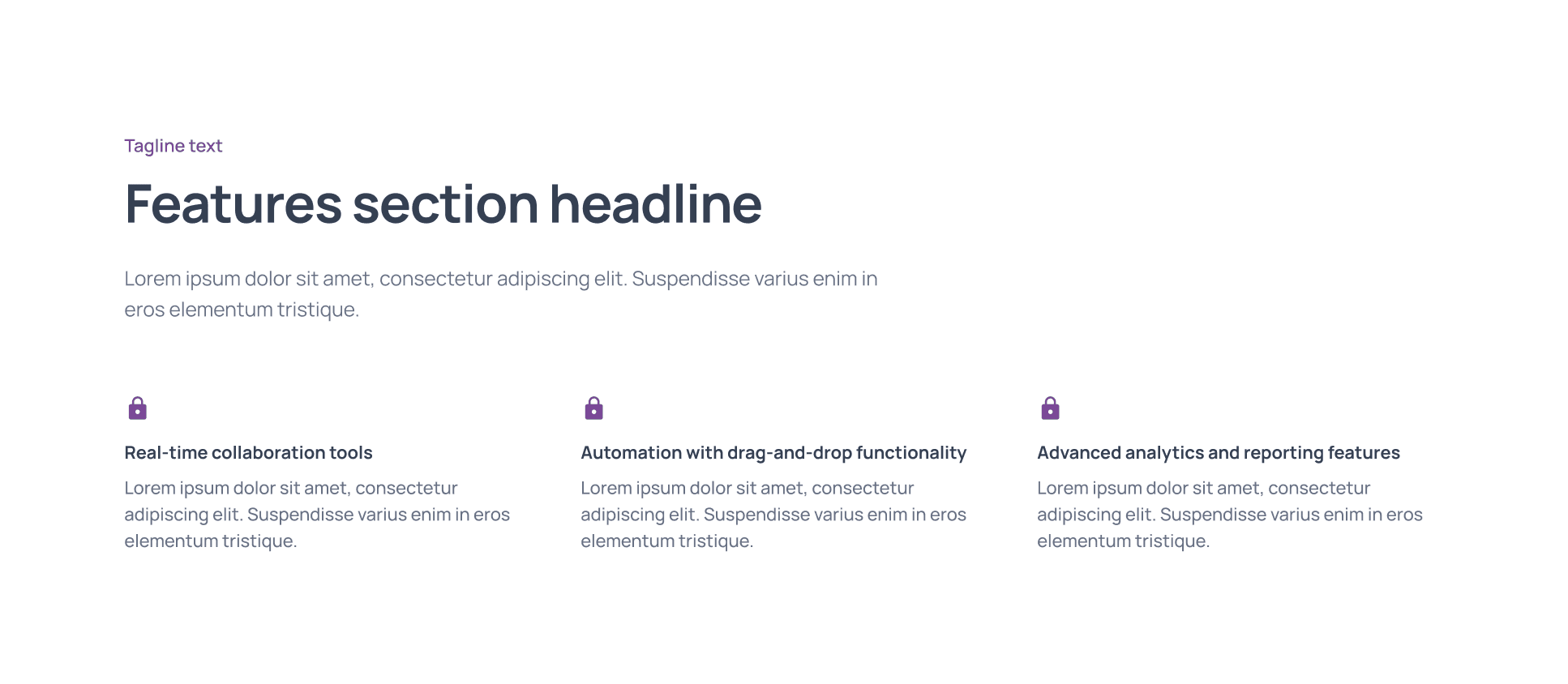
After highlighting the benefits, you can introduce a features list that details the key functionalities of your product or service. This section reassures visitors that your offer has everything they need to solve their problem. Focus on the most important features, and make the list scannable with bullet points or icons.
Example:
Real-time collaboration tools
Task automation with drag-and-drop functionality
Advanced analytics and reporting features
Section 8: Trust Signals (e.g., Certifications, Security Badges)
Incorporating trust signals like security badges, certifications, or industry awards can help reassure visitors that your service is safe, secure, and credible. This is especially important for e-commerce or SaaS products, where customers may be hesitant to enter personal or payment information.
Examples:
SSL certification
GDPR compliance badge
Industry awards or recognitions
Section 9: Lead Capture Form
The lead capture form is often the main goal of a landing page, whether you’re collecting emails for a newsletter, registrations for a webinar, or information for a quote. The key is to keep your form simple—ask only for the necessary information to reduce friction.
Tips:
Limit the number of fields to 3-5.
Use clear labels and offer a value proposition for filling out the form (e.g., “Sign up to receive our free guide”).
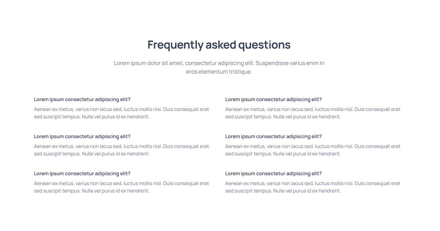
Section 10: Frequently Asked Questions (FAQs)
The FAQ section is an excellent way to address common objections or concerns that may prevent a visitor from converting. Think about the most common questions your target audience has and answer them clearly.
Example Questions:
"How long does the free trial last?"
"Is my data secure?"
"What payment methods do you accept?"
By providing answers upfront, you remove potential barriers to conversion and instill confidence in your visitors.
Section 11: Footer with Key Links
The footer is often overlooked, but it’s a crucial part of the landing page structure. This is where you can include key links to your privacy policy, terms of service, contact information, and even social media profiles. A well-structured footer gives users a sense of completeness and provides them with important information.
Suggestions:
Include links to FAQs, About Us, and Help sections.
Add contact details for customer support.

Conclusion
A well-structured landing page with these 11 must-have sections can significantly boost conversion rates and improve the user experience. Each section serves a purpose, guiding your visitors toward taking action and building trust along the way.
When designing your landing page in Figma, make sure to optimize each section for clarity, readability, and visual appeal. Then, use Detachless UI kit to build your landing and use Detachless to quickly publish your Figma designs directly to the web, streamlining the entire process.
By implementing these sections, you’ll create a high-converting landing page that captures leads, builds trust, and drives results.
FAQs
Why is landing page structure important for conversions?
A well-organized landing page guides visitors through a journey, making it easier for them to understand your offer and take action, ultimately increasing conversions.
What is the best way to design a compelling headline?
A compelling headline should be clear, concise, and focus on the main benefit your product or service provides to the user. It needs to grab attention and encourage the visitor to continue reading.
How can I build trust with visitors on my landing page?
You can build trust by including social proof, such as testimonials, case studies, or reviews, as well as adding trust signals like security badges, certifications, and privacy policies.
What should be included in a lead capture form?
Keep your lead capture form simple by only asking for the essential information. The fewer fields you have, the higher your conversion rate will likely be.
How can Detachless help with landing page publishing?
Detachless allows you to directly publish landing pages designed in Figma, simplifying the process by eliminating the need for manual coding or complicated integrations.


