Imagine spending countless hours crafting a stunning website in Figma, only to find it looks like a jumbled mess on smartphones and tablets. Disappointed? You bet!
In today's world, where most people browse the web on their phones, a website that isn't responsive is a major turn-off for visitors.
Think about it: tiny text that requires squinting to read, buttons crammed together that are impossible to click – these are just a few of the frustrations users face with websites that aren't responsive.
This not only creates a terrible user experience but can also damage your brand image and hurt your business.
The good news is that responsive design is here to save the day! With responsive design, your Figma creations can magically transform to fit any screen size, ensuring a flawless experience for users on desktops, tablets, and smartphones.
Why Responsive Design Matters More Than Ever
We all browse the web differently. Do you only use a giant desktop computer? Probably not! We constantly switch between phones, tablets, and laptops throughout the day. In fact, over half of all website visits come from mobile devices!
If your website isn't responsive, it can look cluttered or even unusable on smaller screens. Imagine the frustration of trying to navigate a website where the text is so tiny you need a magnifying glass to read it, or where buttons are squished together so closely you can't even click on them.
Not a good look, right? Responsive design ensures your website automatically adjusts for any device, keeping visitors happy and coming back for more.
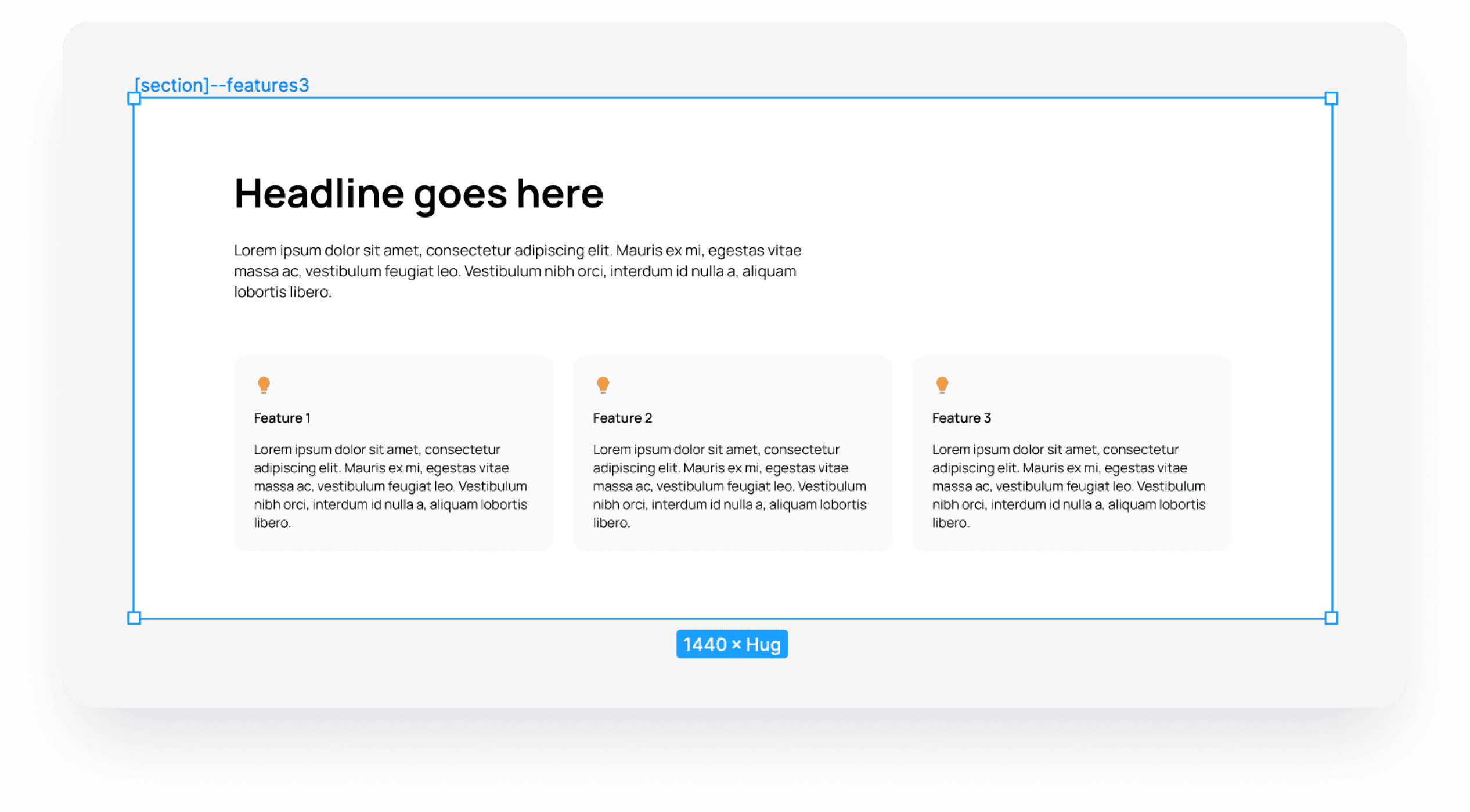
Step by step, we will recreate this feature section to be fully responsive.
Figma Makes Responsive Design A Breeze
Figma offers some amazing tools that make creating responsive websites a breeze. Here are two of the most important ones:
Auto Layout
Imagine your design elements, like buttons and images, magically resizing and repositioning themselves as you change the screen size.
That's the power of Auto Layout! You simply set the basic rules (like how much space to leave around elements), and Figma takes care of the rest. This is a super handy feature for responsive design!
Layout Grids
Think of a layout grid as an invisible ruler for your design. You can set up columns and spacing to create a framework that keeps everything balanced and neat no matter the screen size. This is key for crafting clean and responsive websites in Figma.
Min/Max Width
Figma has another hidden gem for responsive design: Min and Max Width. These features allow you to define the exact width range for your design.
For instance, you can set a minimum width of 320px (typical for small smartphones) and a maximum width of 1440px (common for desktops) to ensure your website looks perfect on any screen size in between. This gives you even more control over how your design adapts to different devices.
Step by step on how to create responsive Design in Figma
Step 1: Create a section frame
You can create it for example 1440px x 1024px (Change height to hug later).
Add auto layout with centered alignment
Left and right padding needs to be a small number because of smaller screens (phones and tables)
Top and bottom padding is up to you, it will be the same on both desktop and mobile breakpoints

Step 2: Create a container frame inside
Set up max width to 1200px (Important for bigger screens)
Set width to fill and height to hug
Spacing in a container depends on your needs, we put 64px for this example
The padding is set to 0.

Step 3: Add a heading frame with a headline and description inside
Set up the max width to 720px if you don't want your text to be too wide
Set width to fill and height to hug
Spacing in a container depends on your needs, we put 24px for this example
The padding is set to 0.

Step 4: Create a feature card
Create a frame with an icon, heading, and description. Style is up to you.
Set up width to fill and height to hug.
Set up min width to 256px and max width to 800px. (important for breakpoints)

Step 5: Create a frame with 3 feature cards inside the container frame
Add auto layout wrap (important for breakpoints)
Set up width to fill and height to hug.
Spacing in a grid depends on your needs, we put 24px for this example

That’s all folks
You can create a fully responsive section in Figma, now you can use Detachless to publish it from Figma to the web.
Figma Missing Pieces: Breakpoints & Publishing
While Figma's Auto Layout, Layout Grids, and Min/Max Width features are powerful tools, there are two additional things you need for truly smooth responsive design: breakpoints and publishing.
Breakpoints
Breakpoints are like magic lines on your screen-size ruler. When your design reaches a breakpoint, the layout can be adjusted in specific ways.
For instance, a menu might disappear entirely on a small phone screen. Breakpoints allow you to control these adjustments for a perfectly responsive experience.
Publishing
Figma is a design tool, not a website launching platform. Once you've perfected your responsive design, you'd typically need to hand it off to someone else who can code it into a real website.
Responsive Design Made Simple with Figma and Detachless
Responsive design doesn't have to be complicated anymore. With Figma's design tools and the publishing power of Detachless, you can create beautiful, responsive websites that work flawlessly on any device, all within Figma.
This means a faster design process, happy visitors on any screen, and complete control over how your website adapts.
Focus on Design, Not Code:
Traditionally, once you've finished your responsive design in Figma, you'd need to hand it off to a developer to translate it into code.
This can be time-consuming and require back-and-forth communication to ensure everything translates perfectly. With Detachless, you can skip this step entirely!
Effortless Publishing:
Once you're happy with your responsive design in Figma, Detachless allows you to publish it directly as a functional website. Simply set your breakpoints (remember, those magic lines where your design adjusts for different screen sizes) using Figma's Min and Max Width features, and Detachless takes care of the rest.
Your website will be live and accessible on any device, with all the responsive magic you've designed baked in.

Stay Agile with Easy Updates:
The beauty of this workflow is its agility. Did you notice a typo or want to update an image on your website? No problem! Just make the changes in your Figma design file and republish with a single click.
Detachless automatically updates your website, keeping it fresh and error-free without the need for any additional coding.
Benefits Beyond Publishing:
Detachless offers more than just seamless publishing. It provides additional features to streamline your responsive design workflow:
Simplified SEO Tools: Help your website climb the search engine rankings with Detachless' built-in SEO tools. Optimize your website's content and meta descriptions directly within Figma, ensuring your responsive creation is easily discoverable by search engines.
Streamlined Collaboration: Working with a team on your website design? Detachless allows for easy collaboration within Figma. Share your design file with team members and keep everyone on the same page throughout the design and publishing process.
Supercharge Your Responsive Design With Detachless's Free Figma UI Kit
Building responsive websites from scratch can be time-consuming. But fear not! Detachless offers a free Figma UI Kit packed with pre-built, responsive components to jumpstart your design process and save you valuable time.
This UI Kit includes a wide range of essential elements, all designed to be responsive and ready to use:
Buttons: Pre-designed buttons in various styles and sizes, ready to adapt perfectly to different screen widths.
Forms: Responsive forms that ensure a smooth user experience on any device, whether it's a desktop, tablet, or smartphone.
Navigation Bars: Easy-to-customize navigation bars that adjust automatically to fit the screen size, making website navigation effortless for visitors.
Cards & Content Blocks: Versatile cards and content blocks that can be easily arranged and resized to create stunning and responsive layouts.
And More! The UI Kit offers a variety of other components, giving you a strong foundation to build beautiful and responsive websites quickly.
Benefits Of Using The Detachless UI Kit:
Save Time & Effort: Skip the hassle of designing individual elements from scratch. The UI Kit provides a library of pre-built, responsive components ready to use.
Maintain Consistency: Ensure a consistent design language across your website with the UI Kit's cohesive set of components.
Focus on Creativity: With the building blocks taken care of, you can dedicate your time to the creative aspects of your design, like choosing colors, fonts, and overall website aesthetics.
Seamless Integration with Detachless: The UI Kit is designed to work flawlessly with Detachless. Simply drag and drop the responsive components into your Figma design, set your breakpoints using Figma's Min and Max Width features, and Detachless will handle the rest when you publish your website.
The Detachless Figma UI Kit and Detachless publishing empower you to create beautiful, responsive websites efficiently. With a wide range of pre-built components, you can save time and focus on crafting a website that looks amazing and functions flawlessly on any device.
Sign up for Detachless today to access the free UI Kit and unlock a whole new way to design and publish responsive websites directly from Figma!
Ready To Publish Responsive Figma Designs with Ease?
Figma and Detachless offer a powerful combination for creating responsive websites. With Figma's intuitive design tools and Detachless's publishing capabilities, you can design beautiful, responsive websites that work flawlessly on any device, all within a single platform.
Sign up for early access to Detachless today and unlock a whole new way to build websites that adapt and impress on any screen!