Figma is a powerful, cloud-based design tool that streamlines web design and collaboration. This guide covers:
Key Benefits of Figma
Real-Time Collaboration: Multiple designers can work simultaneously on the same file, with live cursor tracking and commenting tools.
Reusable Components and Styles: Create consistent design systems with reusable components and styles, ensuring visual coherence across all web pages.
Interactive Prototyping and Animation: Bring designs to life with interactive prototypes and animations, enabling effective user testing and stakeholder presentations.
Responsive Design and Constraints: Build flexible layouts that adapt to various screen sizes and devices, ensuring an optimal user experience across platforms.
Developer Handoff and Asset Export: Streamline the handoff process with Inspect Mode and asset export tools, minimizing communication gaps and errors during implementation.
Mastering Figma for Web Design
Understand Figma's interface, including frames, layers, and organizational features.
Leverage components and styles to maintain consistency and streamline your workflow.
Create interactive prototypes and incorporate animations to enhance user experiences.
Collaborate effectively with your team using real-time editing, commenting, and version control.
Design responsive layouts using constraints and grid systems.
Prepare assets for export and utilize Inspect Mode for seamless developer handoff.
Stay up-to-date with Figma's updates and engage with the Figma Community for inspiration and resources.
By mastering Figma, designers can boost efficiency, creativity, and professional growth in the world of web design.
Related video from YouTube
Using Figma's Interface
Figma's user-friendly interface makes web design straightforward. The workspace provides a clean area to bring your ideas to life.
Toolbar and Workspace Overview
The toolbar at the top contains all the design tools you need, like shapes, text, and drawing tools. The workspace is your canvas for creating and editing design elements.
You can customize the layout by adjusting the position and visibility of panels like Layers, Design, and Prototype. This lets you focus on specific project aspects and streamline your process.
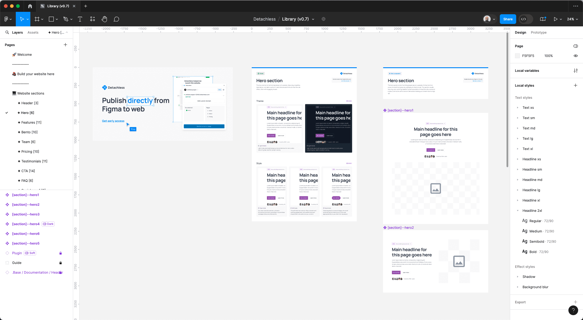
Frames and Layers for Structure
Frames in Figma act as containers for your design elements, helping you organize and structure your web layouts. You can create frames for different pages, sections, or components of your website, making it easier to manage and navigate your project.
The Layers panel displays a hierarchical view of all the elements in your design, allowing you to group, reorder, and nest layers for better organization. By using frames and layers effectively, you can maintain a modular and scalable structure, facilitating collaboration and future updates.
Figma offers powerful features to enhance your productivity:
Features
Auto Layout: Automatically adjusts the layout of elements based on predefined rules, ensuring responsive designs.
Constraints: Define how elements should resize and reposition relative to their parent frame or the canvas, enabling flexible layouts.
Grid Systems: Implement grid-based layouts for consistent spacing and alignment, adhering to web design best practices.
By mastering Figma's interface, tools, and organizational features, you can streamline your web design process, maintain consistency, and collaborate more effectively with your team.
Using Components and Styles
Figma's component and style features help keep your web designs consistent and efficient. By creating reusable components and styles, you can streamline your workflow and easily update designs across multiple pages or projects.
Creating Reusable Components
Components in Figma let you make design elements you can reuse and duplicate anywhere. Here's how:
Select the layer(s) or frame(s) you want to turn into a component.
Right-click and choose "Create Component."
Give your component a clear name.
Click "Create."
You can now insert instances of your component anywhere by dragging it from the Assets panel or using "Duplicate." Changes to the master component will update all instances automatically, ensuring consistency.
Managing Styles
Styles in Figma define consistent colors, fonts, effects, and layout grids across your designs. Creating styles lets you update multiple elements at once, keeping a cohesive look for your web projects.
Creating Color Styles
Step by step
Select an object with the desired color.
Click the four-dot icon in the "Fill" or "Stroke" section.
Click the "+" icon and name your style clearly.
Click "Create Style."
You can now apply the color style to any object by selecting it and choosing the style from "Fill" or "Stroke."
Creating Text Styles
Step by step
Select a text layer with the desired font, size, weight, etc.
Click the four-dot icon in the "Text" section.
Click the "+" icon and name your style clearly.
Click "Create Style."
Apply the text style to any text layer by selecting it and choosing the style from the "Text" section.
Creating Effect Styles
Step by step
Select an object with the desired effect (e.g., shadow, blur).
Click the four-dot icon in the "Effects" section.
Click the "+" icon and name your style clearly.
Click "Create Style."
Apply the effect style to any object by selecting it and choosing the style from the "Effects" section.
By using components and styles, you can keep a consistent look across your web projects, streamline your workflow, and easily update designs.
Prototyping and Animation
Figma allows you to bring your web designs to life with interactive prototypes and animations. This helps you test how users will experience your designs before development starts.
Creating Interactive Prototypes
Interactive prototypes demonstrate how web pages will flow and function. Here's how to create them:
Map User Flows: Identify the key screens, interactions, and transitions users will experience.
Set Up Connections: Select elements that will trigger a transition, like buttons or links. Use the Prototype panel to connect these elements to their destination frames.
Configure Interactions: Specify the interaction type for each connection, such as taps, clicks, drags, or scrolls, to match the intended user experience.
Add Transitions and Animations: Apply transitions and animations between frames. Figma's Smart Animate feature animates transitions automatically, or you can customize the animation settings.
Test and Refine: Test your prototype by simulating user interactions. Identify areas for improvement and iterate until the experience meets your goals.
Interactive prototypes help validate design concepts, gather feedback, and identify usability issues before development.
Adding Animations
Animations enhance the user experience by providing visual cues, guiding users through interactions, and creating a sense of seamlessness. Figma offers tools to incorporate animations into your web designs:
Animation Types
Micro-interactions: Button animations, loading indicators, or subtle transitions provide visual feedback and responsiveness.
Scroll Animations: Reveal content or trigger transitions as users scroll through web pages, guiding them through lengthy content.
Entrance and Exit Animations: Introduce or dismiss elements like modals, tooltips, or notifications in a visually appealing and intuitive manner.
Parallax Effects: Create a sense of depth and movement within your designs, enhancing visual appeal and immersiveness.
Easing and Timing: Adjust the easing and timing of animations to ensure natural and fluid motion, aligning with user experience principles.
Well-designed animations can create a more engaging and intuitive user experience, guiding users through interactions and providing visual feedback that enhances overall usability.
Collaboration and Feedback
Team Collaboration and Real-Time Editing
Figma makes it easy for teams to work together on web designs. With real-time editing, multiple people can edit the same file at once:
Invite Team Members
Share the Figma file link or send email invites. Your team gets instant access to collaborate.
Live Cursor Tracking
See where everyone is working in the file. Cursors move in real time, so you know what's happening.
Collaborative Editing
Multiple designers can make changes simultaneously. Figma tracks all edits, so you can revert if needed.
Commenting and Annotations
Leave feedback directly on the design. Comments and annotations keep everyone on the same page.
Managing Feedback and Iterations
Collecting and using feedback helps improve web designs. Figma has tools to manage this process:
Commenting and Annotations
Team members can leave comments and notes right on the design, pointing out specific areas for improvement.Version Control
Track changes and revert to previous versions. Compare design iterations easily.Branching and Merging
Create separate file branches to try new ideas. Merge approved changes back into the main file.Presentation and Sharing
Share designs with stakeholders or clients. Gather external feedback and incorporate it smoothly.
Collaboration Feature Benefits
Real-Time Editing: Multiple team members can work together simultaneously.
Live Cursor Tracking: See where everyone is working in the file.
Commenting and Annotations: Leave contextual feedback directly on the design.
Version Control: Track changes and revert to previous versions if needed.
Branching and Merging: Experiment with new ideas without affecting the main file.
Presentation and Sharing: Gather feedback from external parties and incorporate it easily.
By using Figma's collaboration and feedback tools, web design teams can work together efficiently, communicate clearly, and iterate on designs to deliver user-friendly web experiences.

Responsive Design with Figma
Using Constraints for Flexible Layouts
Figma's constraints feature helps you create layouts that adapt to different screen sizes. By defining constraints, you control how elements behave when their container resizes.
1. Constraint Types
Figma offers various constraint types:
Fixed: The element maintains its size and position.
Hug Contents: The element resizes to fit its contents.
Fill Container: The element stretches to fill the available space.
Left/Right/Top/Bottom: The element pins to the corresponding edge.
Scale: The element scales proportionally as the container resizes.
2. Applying Constraints
To create flexible layouts, apply constraints based on the desired behavior for each element:
Use Fixed for elements that should maintain their size and position, like logos or icons.
Apply Hug Contents to text elements or containers that should resize based on their content.
Utilize Fill Container for background elements or containers that should stretch to fill the space.
Pin elements to specific edges using Left/Right/Top/Bottom to maintain their position relative to the container.
Leverage Scale for elements that should scale proportionally, like images or illustrations.
3. Combining Constraints
Figma allows you to combine multiple constraints for complex behaviors. For example, set an element to Scale horizontally while pinning it to the Top and Bottom edges, ensuring it maintains its vertical position while scaling in width.
4. Nested Constraints
Nested constraints enable you to create intricate layouts by applying constraints within nested frames or components. This approach is useful for designing responsive user interfaces with multiple levels of hierarchy.
By mastering constraints, you can create web designs that adapt to different screen sizes, ensuring a consistent and user-friendly experience across various devices.
Designing with Grids
Grids help maintain spatial harmony and proportion in web design layouts. Figma's layout grids provide a structured foundation for organizing elements, ensuring a consistent and visually appealing design across different screen resolutions.
Create a Responsive Grid System
Establish a responsive grid system by defining multiple layout grids with different column counts and gutter widths. This approach allows your design to adapt to various screen sizes, maintaining a balanced and visually appealing layout.
Align Elements to the Grid
Leverage Figma's snap-to-grid functionality to align elements precisely to the grid lines. This ensures a consistent and organized layout, enhancing the overall visual coherence of your design.
Utilize Grid Settings
Adjust grid settings, such as column count, gutter width, and margin values, to suit your design requirements. Experiment with different settings to find the optimal balance between content density and whitespace for each screen size.
Establish a Typographic Scale
Integrate a typographic scale into your grid system to maintain consistent and readable text sizes across different screen resolutions. This approach ensures that your content remains legible and visually appealing, regardless of the device or screen size.
Leverage Grid-Based Components
Create reusable components that adhere to your grid system, ensuring consistency and maintainability throughout your design. Grid-based components can be easily adjusted and adapted to different screen sizes, streamlining the responsive design process.
Grid Feature Benefits
Responsive Grid System: Adapts to various screen sizes
Snap-to-Grid: Aligns elements for consistency
Grid Settings: Customizable for design needs
Typographic Scale: Maintains readable text sizes
Grid-Based Components: Ensures consistency and maintainability
By combining constraints and layout grids in Figma, you can create web designs that seamlessly adapt to various screen sizes and devices, providing an optimal user experience across multiple platforms.
Exporting Assets for Developers
Preparing Assets for Export
Figma offers tools to get your design assets ready for web development. Here are some best practices:
1. Organize and Name Assets
Group related assets into frames or components for easy identification and export.
Use clear, descriptive names for layers, frames, and components to help developers understand them.
Use the "Name" property in the right-side panel to rename assets.
2. Mark Assets for Export
Identify assets that need to be exported by selecting them and clicking "Mark for Export" in the right-side panel.
Or use the shortcut
Ctrl/Cmd + Opt/Alt + Eto mark assets quickly.Marked assets will show a small export icon, making them easy to find.
3. Choose Export Formats and Resolutions
Export assets in the right formats based on their use, such as PNG for raster images, SVG for vector graphics, and PDF for multi-page documents.
Adjust the export resolution settings to ensure high-quality assets for various screen densities.
Use the "Export Settings" panel to configure formats, resolutions, and other export options.
4. Use Plugins for Streamlined Workflows
Explore Figma's plugin ecosystem to find tools that automate asset export processes, saving time and effort.
Popular plugins like "Export Helpers" and "Export Framer" can streamline the export workflow and provide additional features.
By following these practices, you can ensure your design assets are well-organized, properly named, and exported in the correct formats and resolutions, making the transition to web development smoother.
Developer Handoff with Inspect Mode
Figma's Inspect Mode helps developers understand and translate your designs into code. Here's how it works:
1. Enabling Inspect Mode
Developers can access Inspect Mode by clicking the "Inspect" button in the top-right corner or using the shortcut
Ctrl/Cmd + Opt/Alt + I.Inspect Mode provides a developer-focused interface for inspecting and navigating designs.
2. Inspecting Design Properties
Developers can hover over or click on any element to see its properties, such as colors, typography, spacing, and dimensions.
The right-side panel displays detailed information about the selected element, including its CSS styles, measurements, and other relevant properties.
3. Copying Code Snippets
Inspect Mode allows developers to copy CSS, iOS, or Android code snippets directly from the design elements.
These code snippets can be easily pasted into the development environment, streamlining the process of translating designs into code.
4. Comparing Versions and Tracking Changes
Developers can compare different versions of a frame to identify changes made by designers, ensuring the final implementation accurately reflects the latest design updates.
This feature helps maintain consistency and reduces the risk of overlooking critical design changes during development.
By using Inspect Mode, developers can better understand the design intent, access crucial design properties, and extract code snippets directly from the Figma file. This integration between design and development promotes collaboration, reduces manual effort, and leads to more accurate and efficient implementations of web designs.
Using Plugins in Figma
Figma offers many plugins to improve your web design process. These plugins can speed up tasks, automate steps, and add new features to help you create better designs more efficiently.
Popular Plugins for Web Design
Here are some useful Figma plugins for web designers:
Quickly create user flows and connect screens
Streamlines mapping user journeys
Automates creating connection lines and flows, saving time
Publish websites directly from Figma to web
Export your Figma designs to code
Connect custom domain to your web design inside Figma
Easily remove backgrounds from images with one click
Useful for clean product mockups or isolating design elements
Faster than manually removing backgrounds
Generate charts and graphs directly in Figma
Supports real-time data from Google Sheets, CSV, JSON, and APIs
Ideal for creating data visualizations and infographics
Apply visual effects like skeuomorphism, neon, glitch, and more
Enhances design elements with unique, eye-catching effects
Saves time compared to creating these effects manually
Collect feedback and votes on design iterations from team members
Helps make informed decisions based on collective input
Streamlines the feedback and iteration process
Using Plugins Effectively
To incorporate plugins into your web design workflow:
Identify Challenges: Look for areas where plugins could streamline tasks or add useful features.
Research Options: Browse the Figma plugin library and read reviews to find the best plugins for your needs. Consider factors like functionality, ease of use, and compatibility.
Prioritize and Integrate: Start with the most impactful plugins first. Learn their features and shortcuts to maximize efficiency.
Customize and Automate: Many plugins offer customization options and the ability to create automation workflows. Tailor them to your specific design requirements and preferences.
Train and Collaborate: Ensure your team members are trained on using the plugins effectively. Collaborate and share best practices for a consistent and streamlined design process.
By strategically using Figma plugins in your web design workflow, you can save time, enhance your designs, and improve collaboration and efficiency within your team.
Keeping Up with Figma Updates
Stay Informed About New Features
Figma is always improving with new tools and capabilities for web design. Staying updated on these changes helps you take full advantage of Figma's latest offerings. Here are some tips:
1. Follow Figma's Official Channels
Subscribe to the Figma Blog for notifications on new releases and updates.
Follow Figma on Twitter and YouTube for announcements and tutorials.
Join the Figma Community to connect with other designers and learn about trends and best practices.
2. Check the Changelog
Regularly review the Figma Changelog to see the latest updates, bug fixes, and new features.
Read the release notes to understand how the updates can improve your web design workflow.
3. Attend Webinars and Events
Participate in Figma's webinars and virtual events to learn about new features directly from the Figma team.
Attend design conferences and meetups where Figma updates and best practices are discussed.
4. Collaborate with Your Team
Encourage team members to share their knowledge of Figma updates during meetings or internal training sessions.
Discuss how the updates can be incorporated into your team's design processes and workflows.
Utilize the Figma Community
The Figma Community is a valuable resource for web designers to find inspiration, templates, and guidance from fellow designers. Here are some tips:
1. Explore Community Resources
Browse the Figma Community to discover a collection of design resources, including templates, UI kits, and plugins.
Search for specific topics or design elements to find relevant resources for your web design projects.
2. Engage with the Community
Join the Figma Community Forum to ask questions, share your work, and connect with other designers.
Participate in discussions to learn from experienced designers and gain insights into best practices.
3. Contribute and Share
Consider sharing your own design resources, templates, or plugins with the Figma Community.
Contribute to discussions by providing feedback, answering questions, or sharing your expertise.
4. Find Inspiration
Follow designers and teams you admire on the Figma Community to stay updated on their latest work and design trends.
Explore the "Featured" and "Popular" sections to discover inspiring designs and learn from the community's best practices.
Community Resource Benefits
Design Resources: Access templates, UI kits, and plugins
Community Forum: Ask questions, share work, and connect
Contribution: Share your expertise and resources
Featured Designs: Find inspiration and learn best practices
By staying up-to-date with Figma's updates and actively engaging with the Figma Community, web designers can continuously improve their skills, streamline their workflows, and create more effective designs.
Conclusion: Using Figma for Web Design
Figma has become a powerful web design tool, offering features that streamline the process, encourage teamwork, and create visually appealing and user-friendly websites. By mastering Figma, designers can boost efficiency, creativity, and professional growth.
Key Takeaways
Collaborative Editing in Real-Time: Figma's cloud-based platform allows teams to collaborate seamlessly, with multiple designers working on the same project simultaneously. This improves communication, reduces back-and-forth, and keeps everyone aligned throughout the design process.
Reusable Components and Styles: Figma's component and style libraries enable designers to create and maintain consistent design systems, ensuring visual coherence across all web pages and interfaces. This saves time and enhances the overall user experience by promoting a cohesive brand identity.
Interactive Prototyping and Animation: Figma's prototyping and animation tools allow designers to bring their designs to life, simulating user interactions and transitions. This enables more effective user testing and stakeholder presentations, leading to better-informed design decisions and improved usability.
Responsive Design and Constraints: With Figma's responsive design capabilities and constraint-based layouts, designers can create flexible designs that adjust to various screen sizes and devices, ensuring a consistent and optimal user experience across all platforms.
Developer Handoff and Asset Export: Figma's developer-friendly features, such as the Inspect Mode and asset export tools, streamline the handoff process, ensuring a smooth transition from design to development. This minimizes communication gaps and reduces the risk of inconsistencies or errors during implementation.
Next Steps for Learning
To continue your journey in mastering Figma for web design, consider the following steps:
Explore Figma's Resources and Documentation: Figma provides educational resources, including tutorials, webinars, and comprehensive documentation. Leverage these materials to deepen your understanding of Figma's features and best practices.
Join the Figma Community: Engage with the Figma Community, where designers share knowledge, insights, and resources. Participate in discussions, seek feedback, and learn from experienced professionals to enhance your skills.
Attend Workshops and Courses: Invest in professional development by attending workshops, online courses, or design bootcamps focused on Figma and web design. These structured learning experiences provide hands-on practice, expert guidance, and valuable feedback.
Experiment and Practice: Continuously apply your Figma knowledge to real-world projects, experimenting with new techniques and pushing your creativity. Embrace a mindset of continuous learning and iteration, as mastering Figma is an ongoing journey that requires dedication and practice.
By utilizing Figma's powerful features, collaborating with fellow designers, and continuously expanding your knowledge, you can boost efficiency, creativity, and professional growth in the world of web design.