Designing for both light and dark modes is an essential step in creating accessible and user-friendly web experiences. Figma offers powerful tools to help designers create and manage these themes efficiently, using local variables to simplify the process. In this guide, we'll explore how to set up a light and dark mode system in Figma by first defining base colors, then creating adaptable themes, and finally applying those themes to your design components. If your project is small or just starting, we'll also cover a simpler approach to using hex colors to quickly create light and dark themes.
Why Light and Dark Modes are Important
In today’s design landscape, users often switch between light and dark modes based on their preferences or ambient lighting conditions. By designing for both modes, you enhance accessibility, user satisfaction, and brand consistency across various environments. Managing these themes can become tedious without the right structure, but Figma’s local variables simplify the process, especially when working with complex or evolving projects.
The Detachless UI Kit is an excellent example of how to organize and manage light and dark themes efficiently in Figma, ensuring your designs adapt seamlessly between modes.
Step 1: Defining Base Colors from 50 to 900
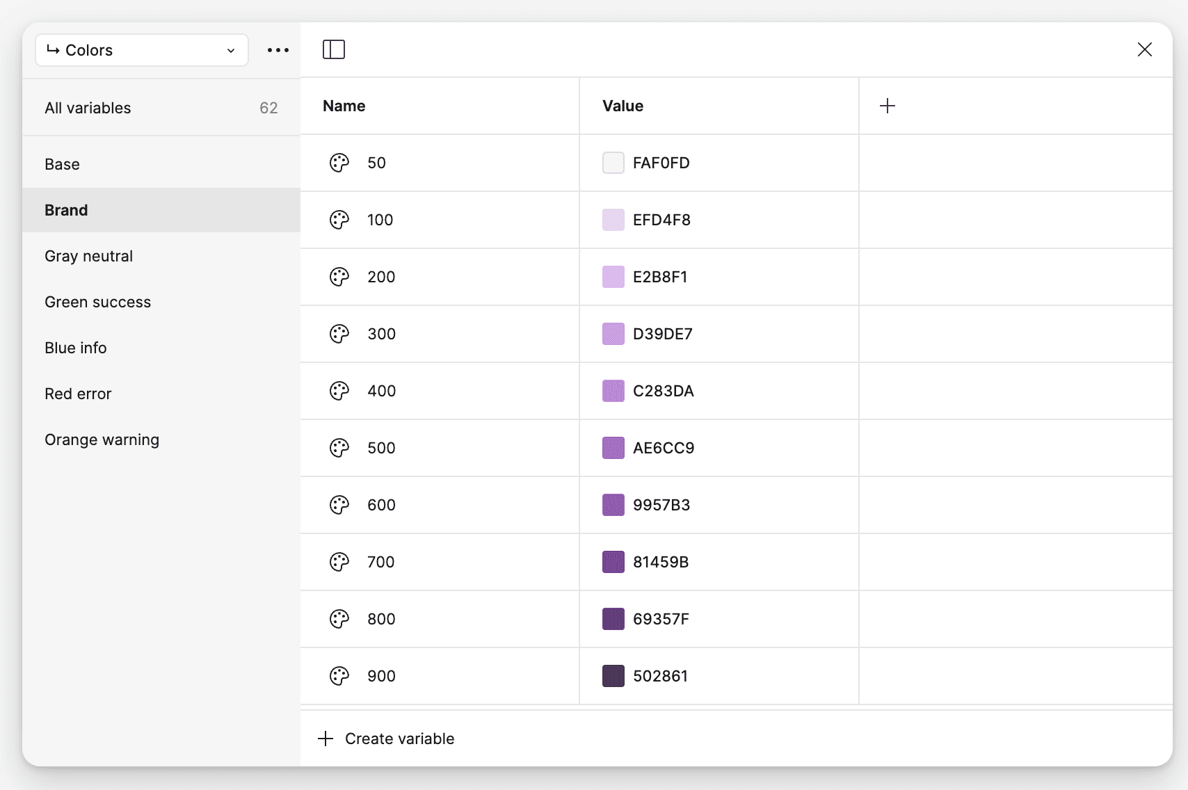
Before setting up your light and dark modes, start by defining a range of base colors. These base colors will serve as the foundation for your light and dark themes, ensuring a structured and scalable approach to your design system.
How to Define Base Colors:
Create a Range: For each primary color (e.g., brand, success, error), define a range from 50 to 900, with each number representing a different shade. For example:
50: Lightest shade (for backgrounds or subtle highlights)
900: Darkest shade (for text, icons, or prominent elements)
Set Up Your Palette: In Figma, define these colors as local variables, allowing you to reference them easily when applying them to components. This range ensures that your design system is flexible and can accommodate both light and dark themes effectively.
By defining base colors upfront, you make it easier to create adaptable themes and maintain consistency across your project.
Step 2: Creating Light and Dark Themes Using Base Colors
Once you’ve established your base colors, you can use these shades to create light and dark modes for your project. By applying local variables, you ensure that your components can automatically switch between the two themes, reducing the need for manual adjustments.
How to Set Up Light and Dark Themes:
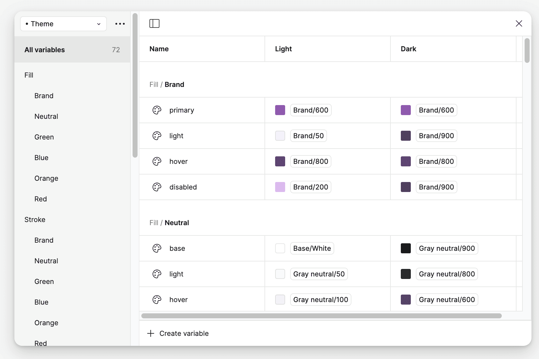
Assign Base Colors to Light and Dark Themes: Use your base colors to define both the light and dark versions of each component in your design system. For example:
Light Mode: Use lighter shades (e.g., Brand/50, Brand/100) for backgrounds and darker shades (e.g., Brand/700, Brand/900) for text or primary actions.
Dark Mode: Reverse the logic by using darker shades (e.g., Brand/900) for backgrounds and lighter shades (e.g., Brand/200) for text and accents.
Create Local Variables: Instead of manually applying color codes to each component, use local variables in Figma to streamline the process. For example, instead of referencing “Brand/700” directly, you can create a variable called fill/brand/primary, which automatically adapts to the theme.
Example from Detachless UI Kit:
The Detachless UI Kit defines fill, stroke, text, and icon colors for both light and dark modes using local variables. This allows designers to easily switch between themes without needing to adjust individual elements.
Step 3: Applying Local Variables to Components
After defining your themes, it’s time to apply the local variables to your design components. This ensures that your components will automatically adapt to whichever theme (light or dark) is being used.
How to Apply Local Variables:
Select Components: Choose the components you want to apply the local variables to, such as buttons, inputs, and icons.
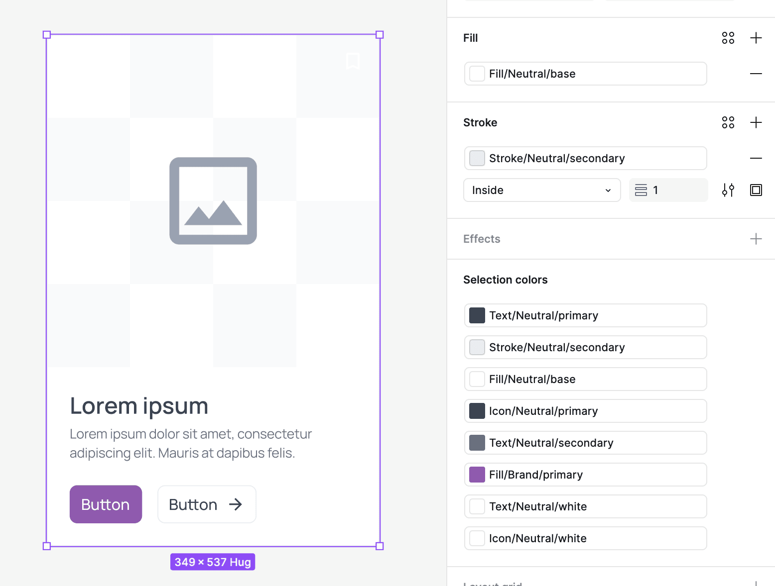
Replace Color Codes with Variables: Instead of assigning colors directly (e.g., #AE6CC9 for purple), apply the local variables you created in Step 2 (e.g., fill/brand/primary). This allows the component to switch between light and dark modes effortlessly.
By using local variables like fill/brand/primary instead of specific hex codes (e.g., Brand/700), you make your components adaptable and scalable across different themes.
Step 4: Managing Typography for Light and Dark Themes
Typography plays a crucial role in ensuring readability in both light and dark modes. Managing typography styles effectively ensures that text remains legible and visually appealing across different themes.
Setting Up Typography for Light and Dark Modes:
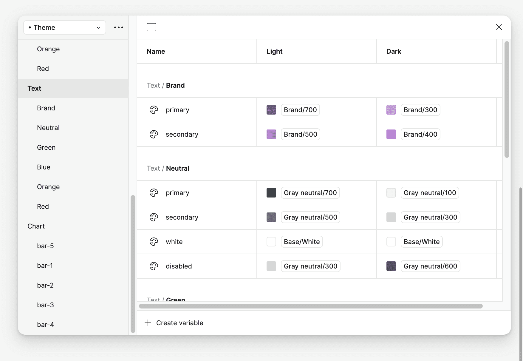
Define Text Styles: Create text styles for headings, body text, and captions. Adjust the weight and color of the text for both light and dark themes.
Light Mode: Use darker text colors for readability against lighter backgrounds.
Dark Mode: Use lighter text colors to ensure legibility against dark backgrounds.
Apply Variables: Assign local variables for text color, such as text/brand/primary or text/neutral/primary, to ensure that text adapts seamlessly between light and dark modes.
In the Detachless UI Kit, typography has been optimized for both themes by applying variables that ensure contrast and legibility are maintained.
Step 5: Testing and Toggling Between Themes
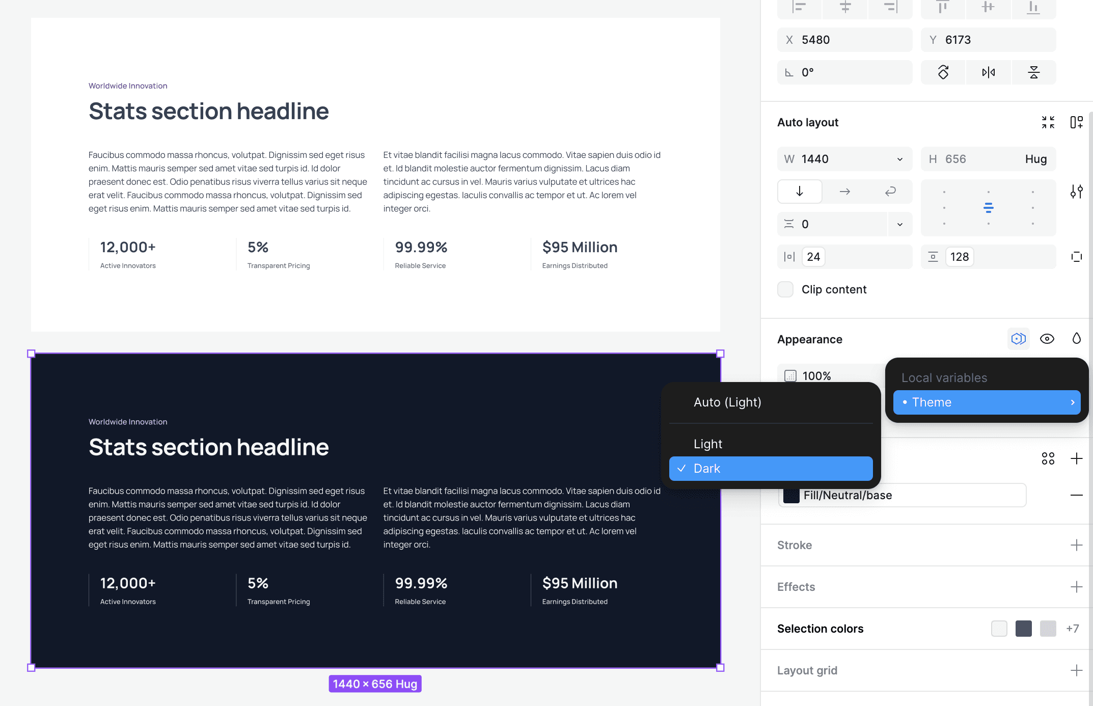
Once your components and typography are set up, it’s essential to test your design to ensure it works well in both light and dark modes. Figma makes it easy to toggle between themes using local variables, allowing you to quickly check for readability, contrast, and user experience.
How to Test Themes in Figma:
Toggle Themes: Use Figma’s variable toggle feature to switch between light and dark modes. This allows you to see how your design adapts in real-time.
Check Accessibility: Test for color contrast and ensure that text and important elements are legible in both themes.
Iterate: Make any necessary adjustments to your variables or components to ensure that the user experience is smooth and consistent across both modes.
By testing both themes thoroughly, you ensure that your design is accessible, visually consistent, and ready for users to switch between light and dark modes seamlessly.
A Simple Approach for Small Projects
If your project is small or in its early stages, you don’t necessarily need a complex base color system. Instead, you can create light and dark themes directly using hex colors.
How to Use Hex Colors for Light and Dark Themes:
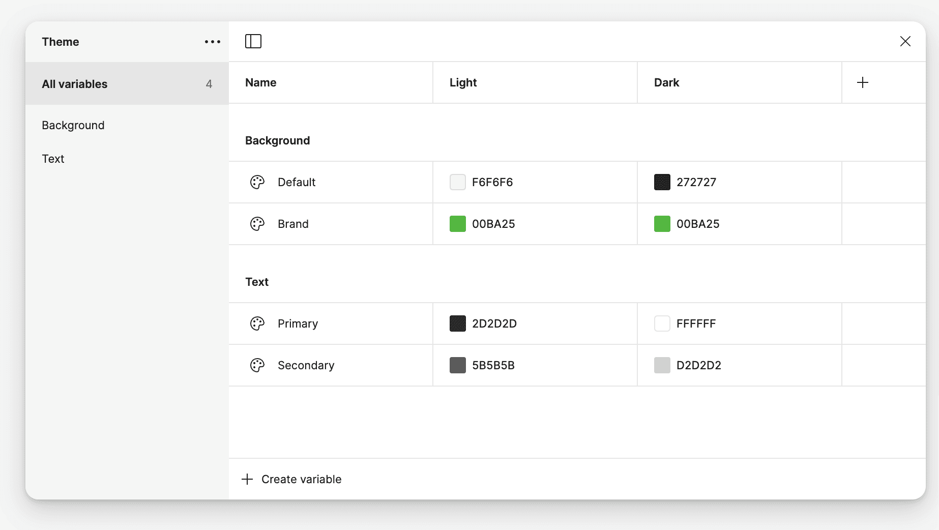
Define Hex Colors for Each Theme: Instead of creating a full range of base colors, you can simply define the specific hex values for your light and dark themes. For example:
Light Mode: Use #FFFFFF for backgrounds and #000000 for text.
Dark Mode: Use #000000 for backgrounds and #FFFFFF for text.
Apply Hex Colors Directly: Apply these hex colors directly to your components without creating a full palette. This is an ideal solution for projects that are small or just starting and don’t require a full design system.
While using hex colors directly is simpler, keep in mind that creating a more complex base color palette will make scaling your design system easier in the future.
Conclusion
Designing for light and dark modes in Figma is an essential part of modern web design. By first defining base colors, creating adaptable themes using local variables, and applying those variables to your components, you ensure that your design remains consistent and adaptable across both modes.
Whether your project is large or small, the Detachless UI Kit offers a great example of how to efficiently manage themes in Figma. For smaller projects, starting with hex colors is a viable approach, but as your project grows, transitioning to a structured base color system will help maintain scalability and consistency.
FAQs
How do I create light and dark themes in Figma?
You can create light and dark themes in Figma by first defining base colors, then using local variables to apply these colors to your components. This ensures that your design adapts seamlessly between themes.
Can I use hex colors directly for small projects?
Yes, if your project is small or just starting, you can use hex colors directly to create light and dark themes. However, for larger projects, it’s recommended to define a base color palette for scalability.
What are local variables in Figma, and why should I use them?
Local variables in Figma allow you to define reusable values for colors, typography, and more. They simplify the process of managing themes and ensure consistency across your design system.
Why is the Detachless UI Kit a good example for managing themes?
The Detachless UI Kit efficiently uses local variables to manage light and dark modes, offering a scalable and organized approach to theme management in Figma.


