How it works
Page structure & responsive design
How to name pages correctly?
Each page should be named as part of the link.
For example, if you have named your page About us, it will be displayed as yourlink.com/about-us
So, our advice is to name your page frames as they will displayed in links:
- pricing
- community
- changelog
How to setup page structure?
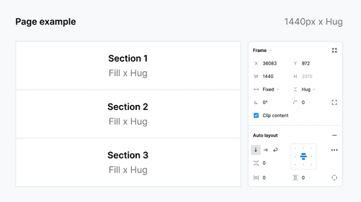
You should design your page to be desktop screen size. For example:
- 1440px (width) x Hug (height)
Your sections should be aligned from top to bottom with auto layout.
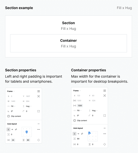
How to setup section structure?
Using auto layout, each of your sections should be set to:
- Fill (width) x Hug (height)
See the example below.
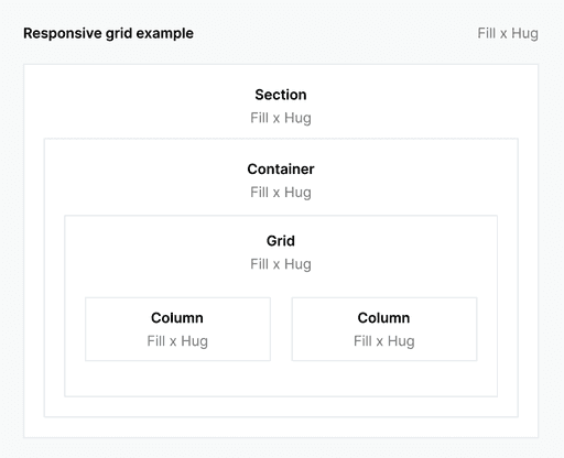
How to make a responsive design for all screens?
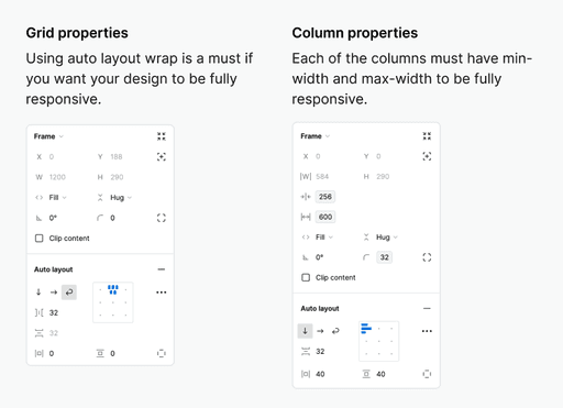
Using auto layout wrap on your grid frame and using min-width and max-width on each of your columns in the grid will be enough for responsive design.
See the example below.
How to make responsive navigation?
When building website navigation, you can use these specific prefixes to create a structured navigation system with hamburger menu on smaller screens:
Navigation Section
[nav]:
This prefix goes on your main navigation section frame
Navigation Container
[nav-container]:
Use this for the container that holds all your navigation elements
Navigation Links
[nav-links]:
This prefix is specifically for the frame containing your navigation links

For customizing the navigation icons' colors, you'll need to add these CSS rules to your Additional CSS:
#hamburger-icon path {
fill: #ffffff; /* Changes hamburger menu icon to white */
}
#close-icon path {
fill: #ffffff; /* Changes close icon to white */
}