Creating a modern web design is essential in today’s digital age. A modern website not only attracts visitors but also provides an exceptional user experience, which can lead to higher engagement and conversions. This guide will walk you through the crucial steps and techniques to design a modern website that stands out and meets the needs of today’s users. By following these principles, you can ensure your website remains relevant and effective in a constantly evolving digital landscape.
Planning Your Modern Web Design
Understanding User Needs
Before diving into the design, it’s crucial to understand the needs and preferences of your target audience. Conduct user research to gather insights about what your audience expects from your website. This step ensures that your design will be user-centered and effective in meeting their needs. Utilize tools like surveys, interviews, and analytics to gain a deep understanding of user behavior and preferences. Understanding your users' pain points and goals allows you to design solutions that truly resonate with them.
Setting Clear Goals
Define clear goals for your website. What do you want to achieve? Whether it's increasing sales, generating leads, or providing information, having a clear objective will guide your design decisions and help you measure success. Setting SMART (Specific, Measurable, Achievable, Relevant, Time-bound) goals ensures that your website design efforts are aligned with your business objectives. Regularly review and adjust these goals as needed to stay on track.
Competitor Analysis
Analyze your competitors' websites to identify strengths and weaknesses. Look for design elements that work well and areas where you can improve. This analysis will help you create a website that not only meets industry standards but also stands out. Tools like SWOT analysis (Strengths, Weaknesses, Opportunities, Threats) can provide a structured approach to understanding your competitive landscape. Learn from the best practices and avoid the pitfalls observed in competitor websites.
Key Elements of Modern Web Design
Responsive Design
Importance: With the increasing use of mobile devices, ensuring that your website is responsive is critical. Responsive design ensures that your website adapts seamlessly to different screen sizes, providing an optimal user experience on desktops, tablets, and smartphones. A responsive website not only improves user satisfaction but also boosts your SEO rankings, as search engines favor mobile-friendly sites.
Techniques:
Fluid Grid Layouts: Use relative units like percentages instead of fixed units like pixels to create flexible layouts that adapt to different screen sizes.
Flexible Images: Ensure images scale appropriately within their containing elements to avoid overflow and maintain visual integrity.
Media Queries: Apply different CSS styles based on the device's screen size, resolution, and orientation to ensure that the design adapts perfectly.
Testing: Regularly test your design on various devices and screen sizes to ensure compatibility and a consistent user experience across all platforms.
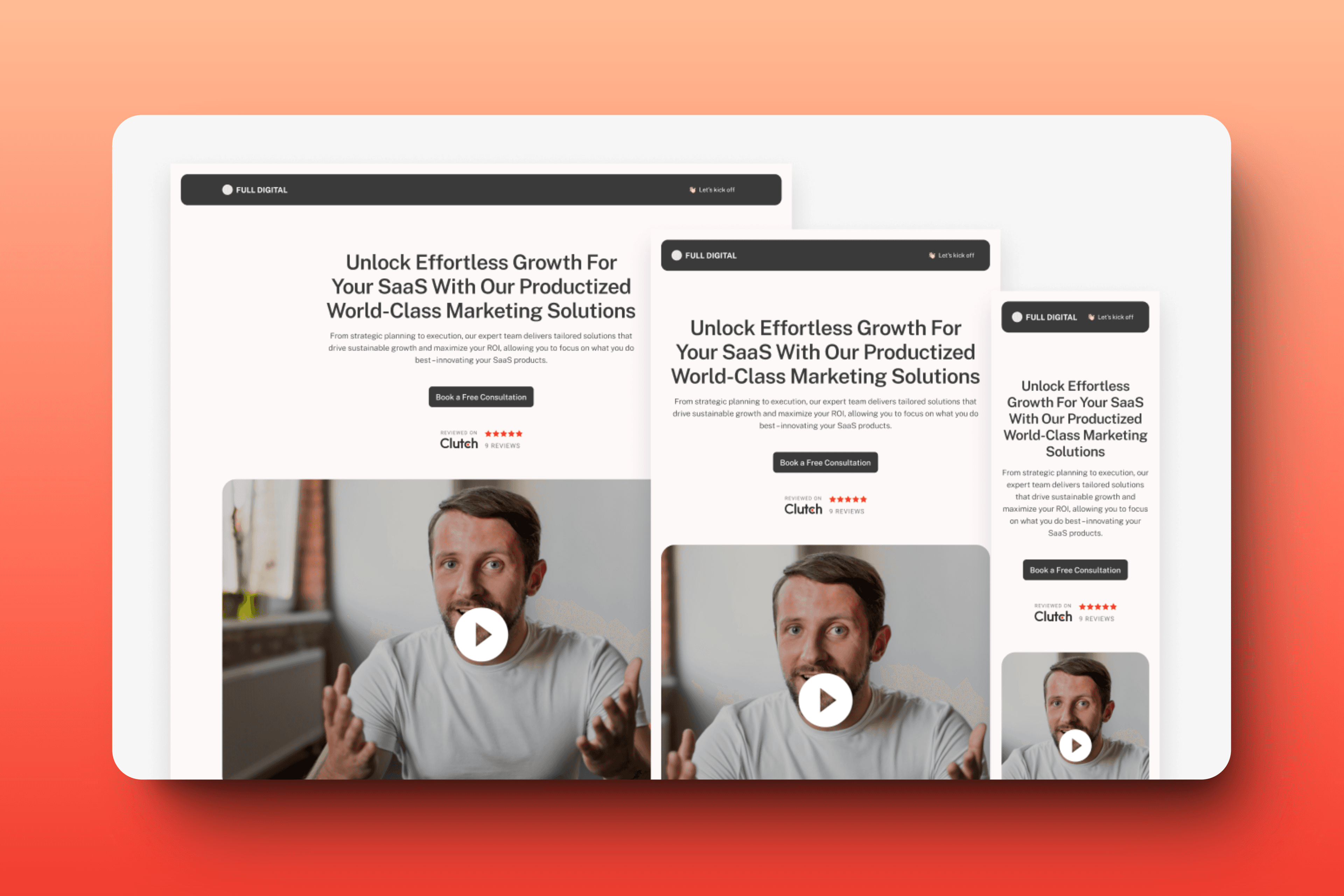
Visual Hierarchy
Importance: Visual hierarchy helps users navigate your site and understand the most important information quickly. By organizing content effectively, you can guide users' attention to key elements. Effective visual hierarchy reduces cognitive load, making it easier for users to find what they need and perform desired actions.
Techniques:
Typography: Use different font sizes, weights, and colors to establish a hierarchy. Headlines should be bold and larger, while body text should be smaller and more readable. Consistent use of fonts and styles helps establish a clear visual hierarchy.
Color: Use contrasting colors to highlight important elements. A consistent color scheme helps maintain visual coherence and directs attention to key areas.
Layout: Arrange content logically, with the most critical information at the top. Use visual cues like lines, boxes, and spacing to create distinct sections and guide the user's eye through the page.
Imagery and Icons: Use images and icons strategically to break up text and add visual interest, making the content more engaging and easier to scan.
Minimalism
Importance: Minimalist design reduces clutter and focuses on essential elements. This approach improves usability and creates a clean, modern look. Minimalism also enhances the website's performance by reducing the number of elements that need to be loaded.
Techniques:
Whitespace: Use whitespace effectively to create a clean and uncluttered look. It helps to separate different sections and guide the user's eye through the content.
Essential Elements Only: Include only necessary elements and avoid overloading the page with information or graphics. Focus on key messages and primary actions.
Simple Navigation: Ensure the navigation is straightforward and intuitive, reducing the number of clicks needed to find information.
Consistent Visual Style: Maintain a consistent and simple visual style throughout the site to enhance clarity and focus.
User Experience (UX)
Importance: A good user experience keeps visitors engaged and encourages them to return. UX design involves creating a website that is easy to use and meets the needs of your users. Investing in UX design can lead to higher customer satisfaction, better retention rates, and increased conversions.
Techniques:
Conduct Usability Testing: Identify and fix issues by testing your website with real users. Gather feedback and make necessary adjustments to improve usability.
Use Intuitive Navigation: Design your website so users can navigate it without confusion. Use familiar layouts and elements that users expect.
Enhance Accessibility: Ensure your site is accessible to all users, including those with disabilities. This includes screen reader compatibility and keyboard navigation.
Provide Feedback: Offer visual and interactive feedback to users' actions, such as highlighting a clicked button or displaying a confirmation message. This helps users understand the results of their actions and improves interaction.

Accessibility
Importance: Accessible design ensures that all users, including those with disabilities, can use your website. It’s not only a legal requirement in many places but also broadens your audience. Accessibility improves the overall user experience and can enhance your SEO as search engines favor accessible websites.
Techniques:
Alt Text for Images: Provide descriptive alt text for all images to help visually impaired users understand the content.
Keyboard Navigation: Ensure the site is navigable using a keyboard, allowing users who cannot use a mouse to access all functionality.
Readable Fonts: Use fonts that are easy to read and provide sufficient contrast between text and background to aid users with visual impairments.
ARIA (Accessible Rich Internet Applications) Landmarks: Implement ARIA landmarks to define regions of a page, making it easier for assistive technologies to navigate and interact with the content.
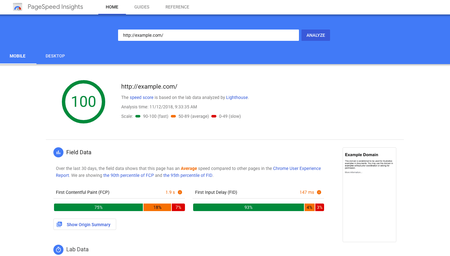
Performance Optimization
Importance: Fast-loading websites provide a better user experience and are favored by search engines. Optimizing your website’s performance can reduce bounce rates and improve search rankings. Performance optimization is crucial for retaining users and ensuring they have a smooth and enjoyable experience.
Techniques:
Optimized Images: Compress and resize images to reduce load times without sacrificing quality. Use modern image formats like WebP for better compression.
Minimize HTTP Requests: Reduce the number of requests by combining files and using CSS sprites. Fewer requests mean faster load times.
Leverage Browser Caching: Enable caching to reduce the load on the server and speed up page load times. Cached resources can be loaded faster on subsequent visits.
Modern Website Techniques
Parallax Scrolling
Description: Parallax scrolling creates a sense of depth by moving background images slower than foreground content. This technique adds visual interest and can enhance storytelling.
Implementation:
Use CSS to create parallax effects.
Ensure it does not negatively impact performance.
Test on various devices for smooth functionality.
Microinteractions
Description: Microinteractions are small animations that provide feedback to users, such as button hover effects or loading animations. They make the interface feel more interactive and engaging.
Implementation:
Use CSS animations and transitions.
Ensure they are subtle and enhance usability.
Avoid overuse, which can become distracting.
Custom Illustrations
Description: Custom illustrations can make your website stand out and convey your brand’s personality. They add a unique touch that stock photos often lack.
Implementation:
Hire an illustrator or use tools like Adobe Illustrator.
Ensure illustrations align with your brand’s style.
Optimize for web performance.
Dark Mode
Description: Dark mode is a design trend that offers a dark-themed user interface. It reduces eye strain and can save battery life on OLED screens.
Implementation:
Provide a toggle switch for users to switch between light and dark modes.
Use CSS variables to manage color schemes.
Ensure readability and contrast in dark mode.
Web Design Tips
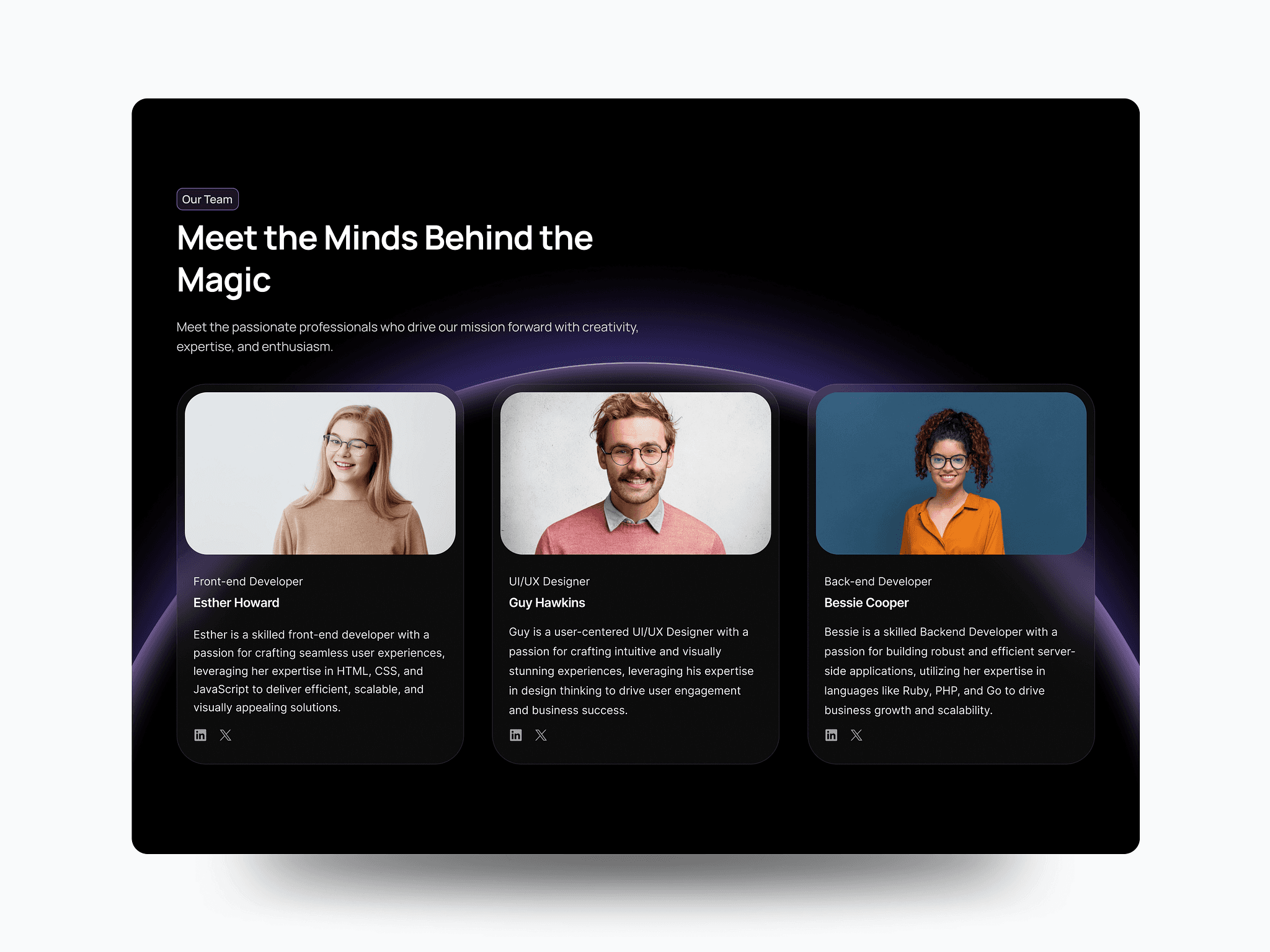
Consistency and Branding
Importance: Consistency in design elements and branding creates a cohesive and professional look. It helps build trust and recognition with your audience. A consistent visual identity ensures that all elements of your website, from fonts to color schemes to button styles, align with your brand’s message and values. This consistency not only improves aesthetics but also enhances user experience by providing a predictable and familiar interface.
Tips:
Use a Style Guide: Develop a comprehensive style guide that outlines your brand’s fonts, colors, button styles, and other design elements. This guide will serve as a reference for maintaining consistency across all pages and content.
Design Systems: Implement design systems that include reusable components and templates. These systems ensure that new pages or features adhere to the established design principles.
Regular Audits: Conduct regular design audits to ensure all elements on your website adhere to your style guide and branding guidelines. This helps identify and correct inconsistencies.
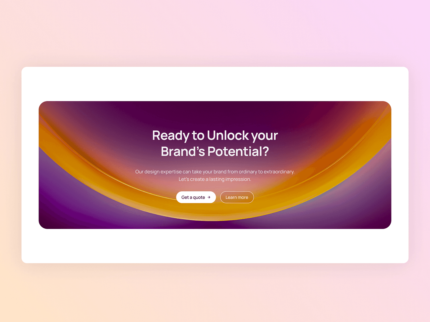
Effective Call to Actions (CTAs)
Importance: CTAs guide users towards desired actions, such as signing up for a newsletter or making a purchase. Well-designed CTAs can significantly improve conversion rates by making it clear what action the user should take next.
Tips:
Action-Oriented Language: Use compelling, action-oriented language that clearly communicates the benefit of taking the action. Phrases like "Sign Up Now" or "Get Started Today" are effective.
Prominent Placement: Place CTAs in prominent locations where they are easily noticeable, such as above the fold or at the end of content sections.
Contrasting Colors: Use colors that stand out from the rest of the page to draw attention to the CTA. Ensure the text is readable and the button is easily clickable.
High-Quality Content
Importance: Quality content engages users, provides value, and establishes your site as an authority. It also plays a crucial role in SEO and driving organic traffic to your website.
Tips:
Clear and Concise: Write clear, concise, and relevant content that directly addresses the needs and interests of your audience.
Multimedia Integration: Incorporate images, videos, infographics, and other multimedia elements to make your content more engaging and easier to understand.
Regular Updates: Keep your content fresh and up-to-date. Regularly add new articles, blog posts, and updates to keep your audience engaged and improve your SEO.
SEO Best Practices
Importance: SEO optimizes your website for search engines, helping it rank higher and attract organic traffic. Implementing SEO best practices is essential for visibility and growth.
Tips:
Keyword Research: Identify relevant keywords that your target audience is searching for. Integrate these keywords naturally into your content, headings, and meta descriptions.
On-Page SEO: Optimize individual pages to rank higher and earn more relevant traffic. This includes using proper heading tags, meta descriptions, and alt text for images.
Technical SEO: Ensure your website is technically sound with fast load times, mobile-friendliness, and secure connections (HTTPS).
Internal Linking: Use internal links to help users navigate your site and improve the SEO of your individual pages.
Conclusion
Creating a modern web design involves understanding the needs of your users, setting clear goals, and implementing key design principles. By focusing on responsive design, visual hierarchy, minimalism, user experience, accessibility, performance optimization, and incorporating modern website techniques, you can create a website that stands out and delivers a great user experience. Remember to maintain consistency in branding, use effective CTAs, produce high-quality content, and follow SEO best practices to ensure your website’s success.