User interface (UI) design is the cornerstone of creating digital products that are both functional and enjoyable to use. Mastering UI design techniques is crucial for designers aiming to craft interfaces that enhance user experience and drive engagement. This comprehensive guide explores ten essential user interface design best practices, providing valuable UI design tips to help you create intuitive and effective interfaces.
Key UI Design Techniques for Simplicity and Clarity
The foundation of effective UI design is simplicity. A clean, uncluttered interface allows users to focus on their tasks without distraction.
Key points:
Use clear, concise language
Employ intuitive icons and symbols
Minimize the number of elements on each screen
Utilize negative space effectively
Example:
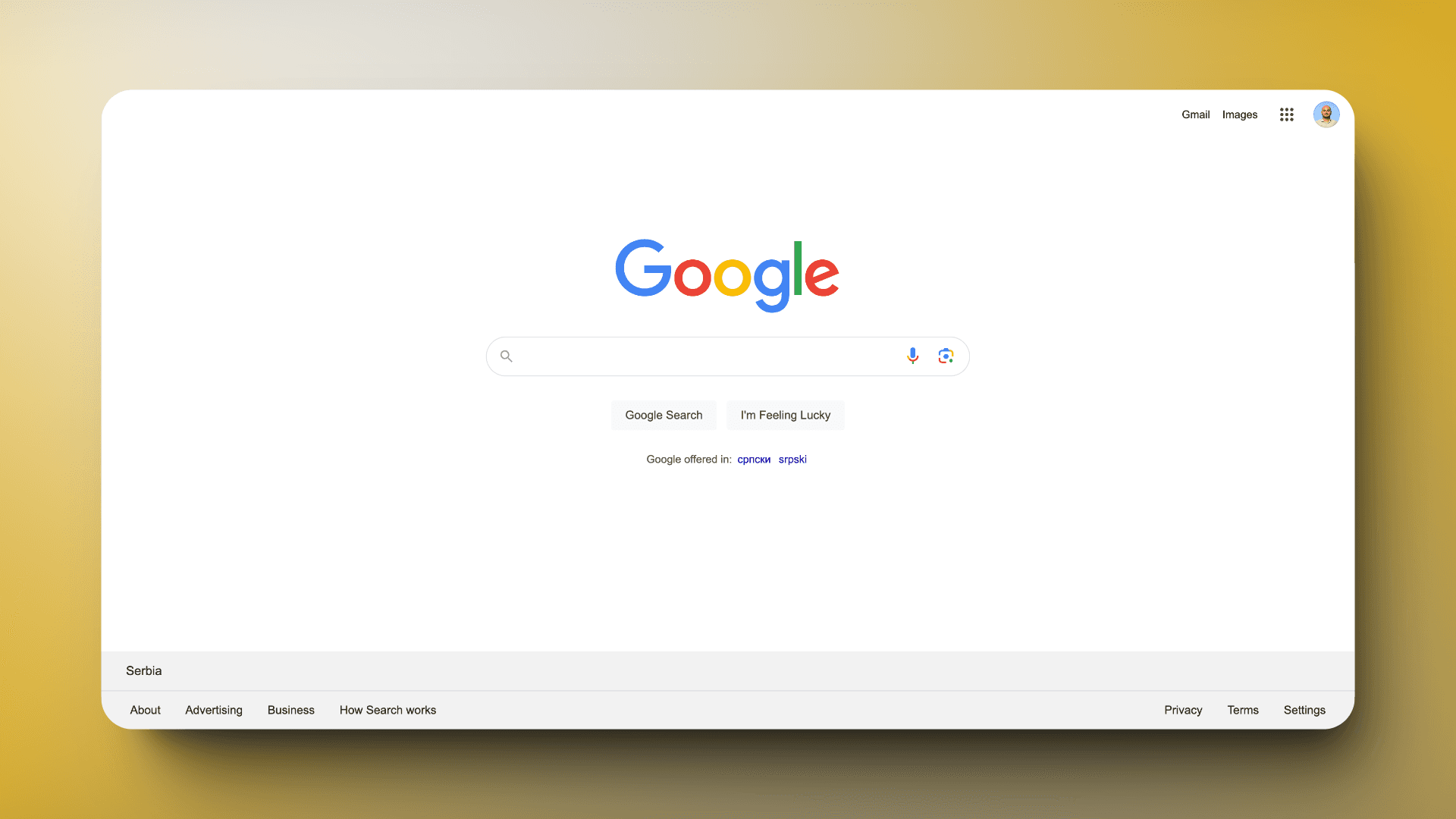
Consider the Google homepage. Its minimalist design, featuring just a logo, search bar, and a few essential links, exemplifies simplicity in UI design. This approach allows users to focus on the primary task - searching - without any distractions.
Implementation tips:
Conduct a content audit to identify and remove unnecessary elements
Use progressive disclosure to reveal information gradually
Implement a clear visual hierarchy to guide users' attention
By prioritizing simplicity, you reduce the cognitive load on users, making your interface more accessible and easier to navigate.
User Interface Tips for Maintaining Consistency
Consistency in UI design creates a sense of predictability and familiarity, which enhances usability and user confidence.
The cornerstone of effective UI design is simplicity. A clean, uncluttered interface allows users to focus on their tasks without distraction.
Key points:
Use clear, concise language
Employ intuitive icons and symbols
Minimize the number of elements on each screen
Utilize negative space effectively
Example:
Consider the Google homepage. Its minimalist design, featuring just a logo, search bar, and a few essential links, exemplifies simplicity in UI design. This approach allows users to focus on the primary task - searching - without any distractions.
Implementation tips:
Conduct a content audit to identify and remove unnecessary elements
Use progressive disclosure to reveal information gradually
Implement a clear visual hierarchy to guide users' attention
By prioritizing simplicity, you reduce the cognitive load on users, making your interface more accessible and easier to navigate.
Maintain Consistency
Consistency in UI design creates a sense of predictability and familiarity, which enhances usability and user confidence.
Key aspects of consistency:
Visual consistency (colors, typography, button styles)
Functional consistency (similar elements behave the same way)
External consistency (alignment with platform conventions)
Example:
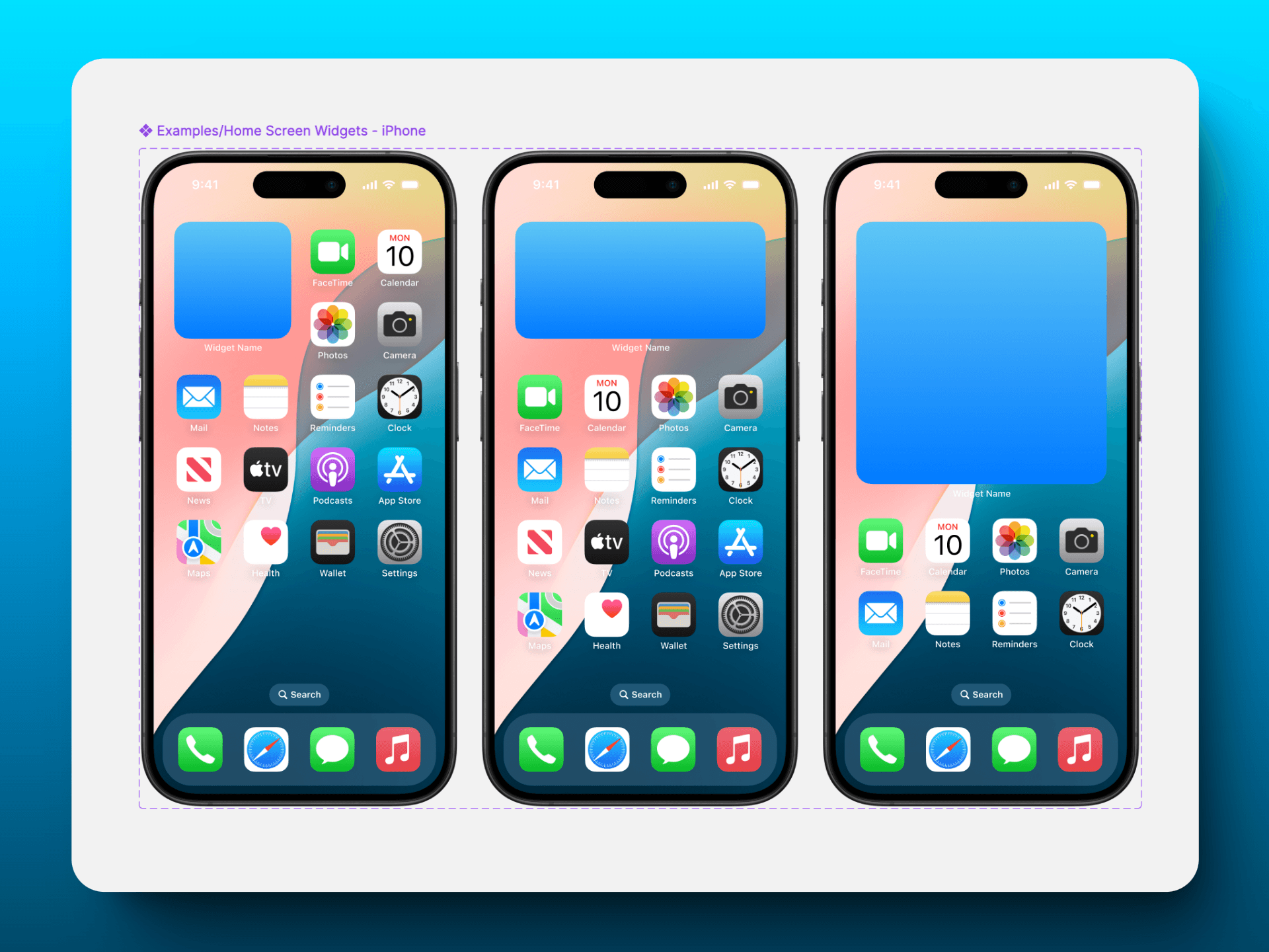
Apple's iOS interface maintains strong consistency across its native apps. The navigation bar is always at the top, the tab bar at the bottom, and interactive elements like buttons and switches have a consistent look and feel throughout the system.
Implementation tips:
Create and maintain a design system or style guide
Use reusable components and patterns
Conduct regular design reviews to ensure consistency
Consistency not only makes your interface more intuitive but also speeds up the learning curve for new users.
Enhancing User Experience: Providing Clear Feedback in UI Design
Feedback is crucial in UI design as it confirms users' actions and helps them understand the system's state.
Types of feedback:
Visual (color changes, animations)
Auditory (sounds, tones)
Haptic (vibrations on mobile devices)
Example:
When you send an email in Gmail, a brief message appears confirming that the email was sent. This simple feedback reassures users that their action was successful.

Implementation tips:
Use micro-interactions to acknowledge user actions
Provide progress indicators for longer processes
Use toast messages or notifications for important updates
Accessibility in UI Design: Techniques for Inclusive Interfaces
Accessible design ensures that your interface can be used by people with various abilities, including those with visual, auditory, motor, or cognitive impairments.
Key considerations:
Color contrast
Text size and readability
Keyboard navigation
Screen reader compatibility
Example:
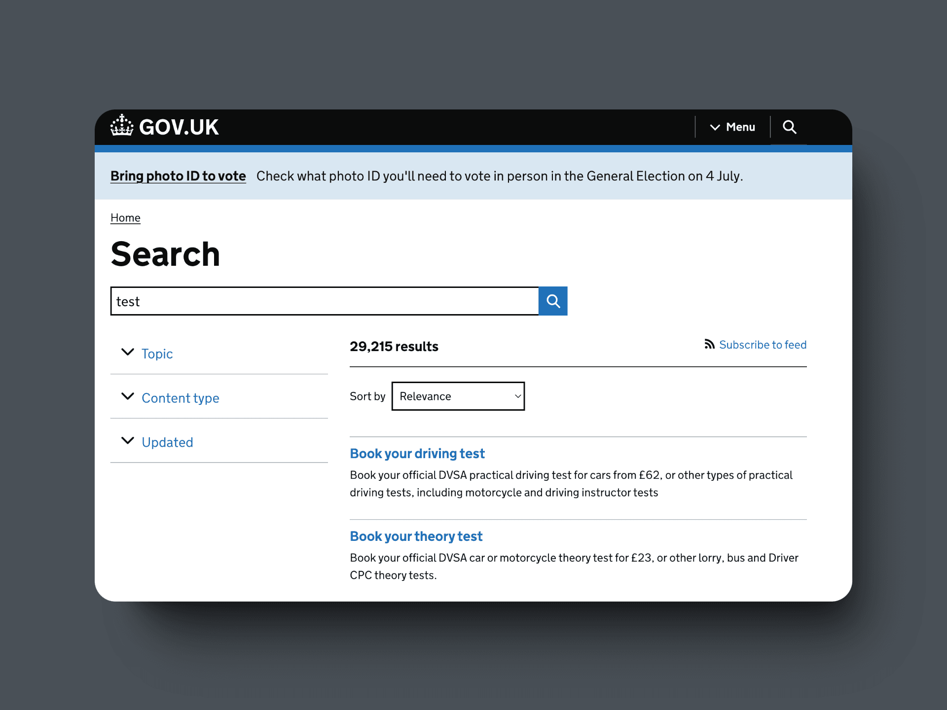
The UK government's website (GOV.UK) is renowned for its accessibility. It features high-contrast text, and clear headings, and is fully navigable by keyboard.
Implementation tips:
Follow WCAG (Web Content Accessibility Guidelines) standards
Use tools like color contrast checkers
Implement proper heading structures and alt text for images
Test your interface with various assistive technologies
Designing for accessibility not only helps users with disabilities but often improves usability for everyone.
UI Design Techniques for Effective Visual Hierarchy
Visual hierarchy guides users' attention to the most important elements first, creating a natural flow through the interface.
Visual hierarchy guides users' attention to the most important elements first, creating a natural flow through the interface.
Techniques for creating visual hierarchy:
Size (larger elements draw more attention)
Color (brighter or contrasting colors stand out)
Placement (elements at the top or left are noticed first in Western cultures)
White space (isolated elements attract focus)
Example:
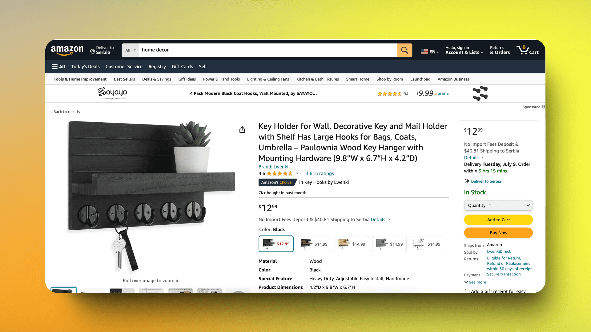
Amazon's product pages use visual hierarchy effectively. The product title is large and prominent, followed by the price, rating, and buy button - all sized and placed to guide the user's eye to key information.
Implementation tips:
Use a grid system to organize content
Apply the squint test to check if important elements stand out
Use heat mapping tools to analyze user attention patterns
A well-implemented visual hierarchy makes interfaces more intuitive and easier to scan quickly.
Implementing Responsive Design: Essential UI Design Techniques
With the variety of devices used to access digital products, responsive design is no longer optional - it's essential.
Key principles:
Fluid grids
Flexible images
Media queries
Example:
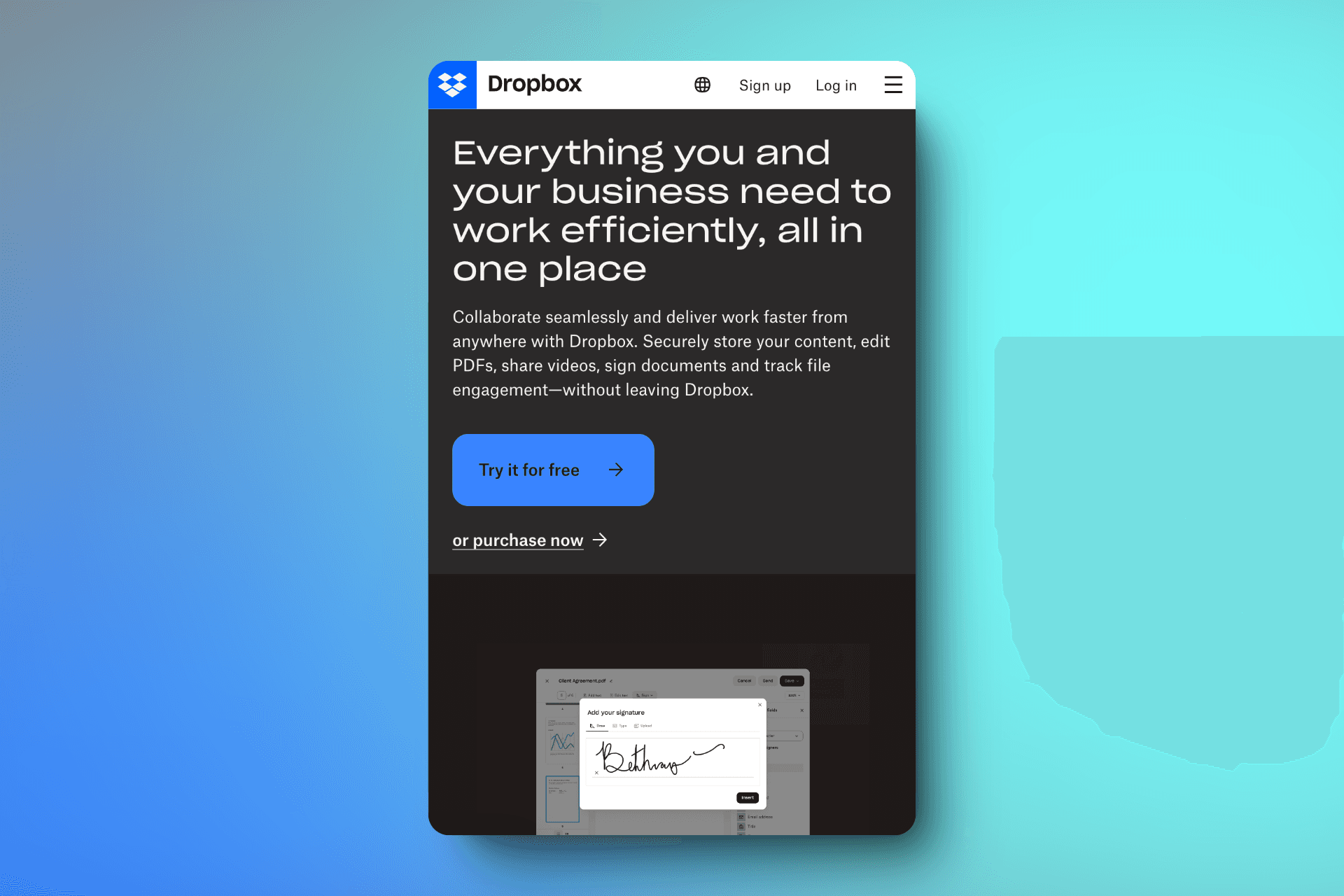
The website for Dropbox adapts seamlessly across devices, restructuring content and navigation to suit different screen sizes while maintaining functionality and brand consistency.
Implementation tips:
Use a mobile-first approach to design
Test on various devices and screen sizes
Consider how touch interactions differ from mouse-based interactions
Responsive design ensures a consistent and optimized experience across all devices, improving user satisfaction and engagement.
User Interface Optimization: Techniques for Faster Loading Times
In our fast-paced digital world, users have little patience for slow-loading interfaces. Optimizing loading times is crucial for retaining users and improving overall satisfaction.
Strategies for optimization:
Compress and optimize images
Minify CSS, JavaScript, and HTML
Implement lazy loading for images and content
Use content delivery networks (CDNs)
Example:
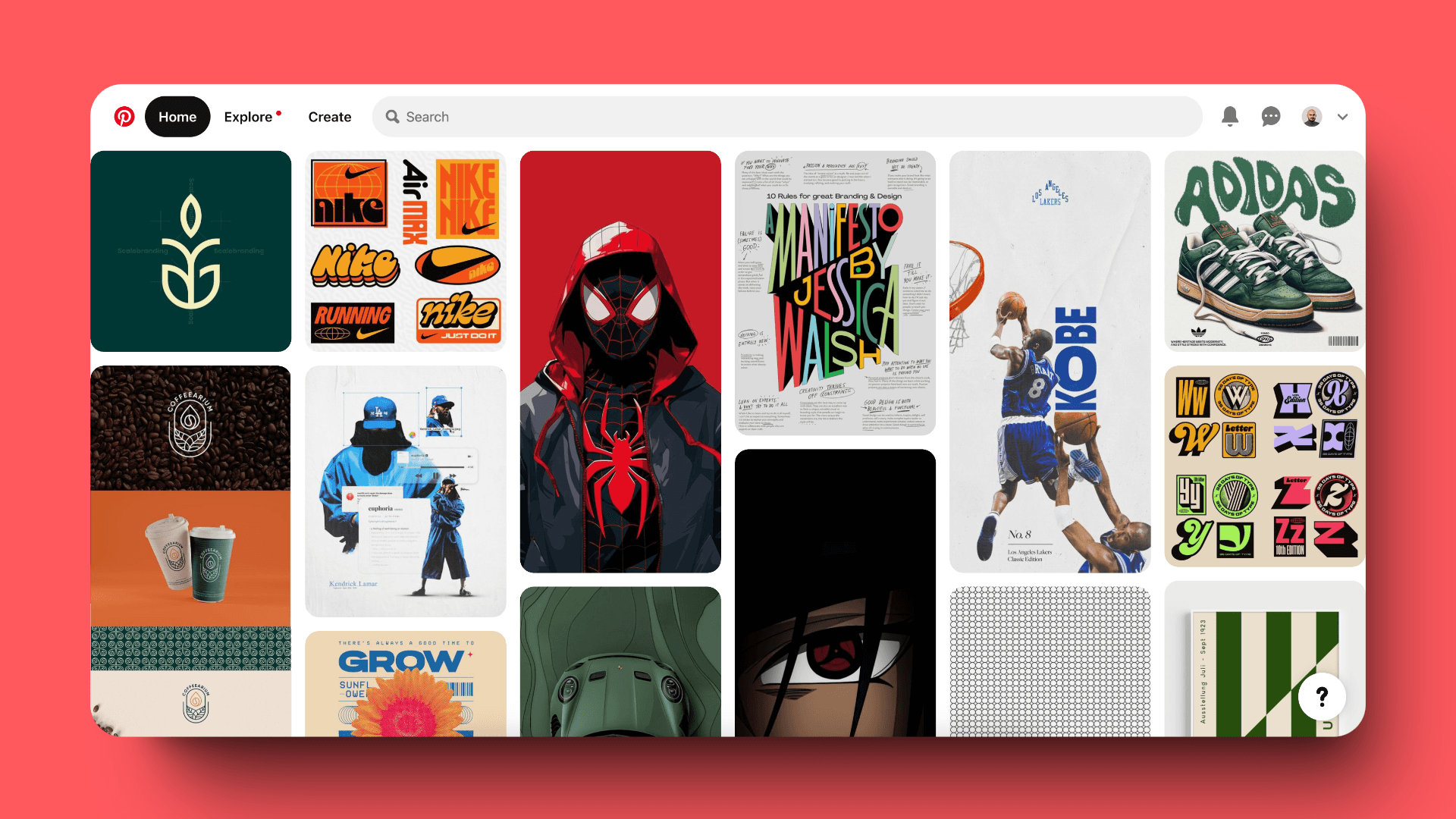
Pinterest uses infinite scrolling with lazy loading, allowing users to browse endless content without experiencing significant load times.
Implementation tips:
Use tools like Google PageSpeed Insights to identify performance issues
Implement skeleton screens to give the impression of faster loading
Prioritize above-the-fold content loading
Faster loading times not only improve user experience but can also positively impact SEO rankings.
UI Design Best Practices: Following Platform-Specific Guidelines
Each platform (iOS, Android, Web) has its own design guidelines. Following these guidelines creates a sense of familiarity for users and ensures your app feels native to the platform.
Key guidelines:
Material Design for Android
Human Interface Guidelines for iOS
Microsoft Fluent Design for Windows
Example:
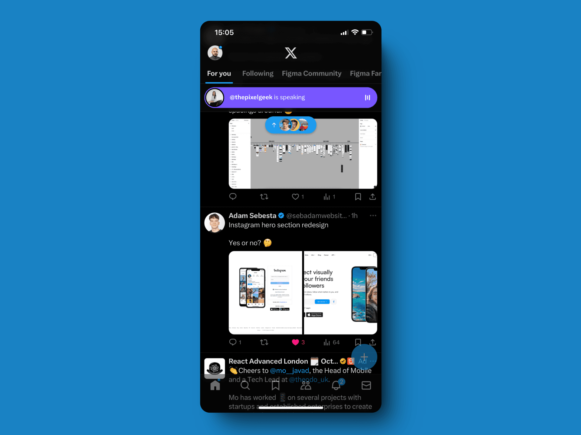
The Twitter app follows platform-specific guidelines, resulting in subtle but important differences between its iOS and Android versions, such as the placement of the navigation bar.
Implementation tips:
Study and refer to the official platform design documentation
Use platform-specific UI kits and components
Consider creating platform-specific versions of your app rather than a one-size-fits-all approach
Adhering to platform guidelines can significantly reduce the learning curve for new users and improve overall usability.
The Power of Whitespace: UI Design Tips for Effective Use
Whitespace, or negative space, is a powerful design tool that can improve readability, focus attention, and create a sense of elegance and sophistication.
Benefits of whitespace:
Improves readability
Creates visual hierarchy
Enhances the overall aesthetic appeal
Reduces cognitive load
Example:
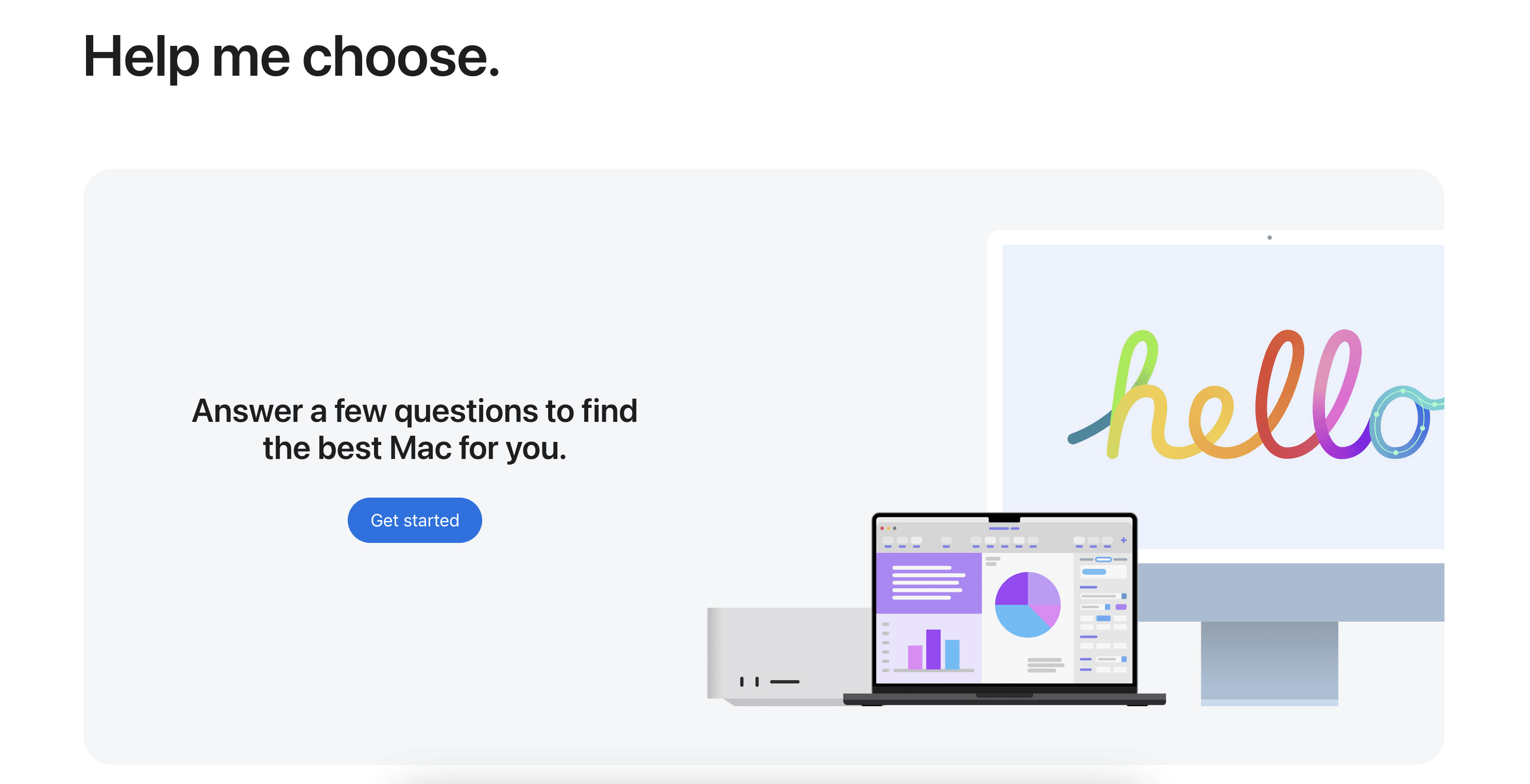
Apple's website makes extensive use of whitespace, creating a clean, uncluttered look that allows product images and key messages to stand out.
Implementation tips:
Don't fear empty space - it's a design element in itself
Use whitespace to group related elements and separate unrelated ones
Be consistent with your use of whitespace throughout the interface
Effective use of whitespace can make your interface feel more open, modern, and easy to navigate.
Refining Your UI: User Testing Techniques for Interface Design
No matter how experienced the designer is, user testing is crucial for identifying usability issues and areas for improvement.
Types of user testing:
Usability testing
A/B testing
Card sorting
Eye tracking
Example:
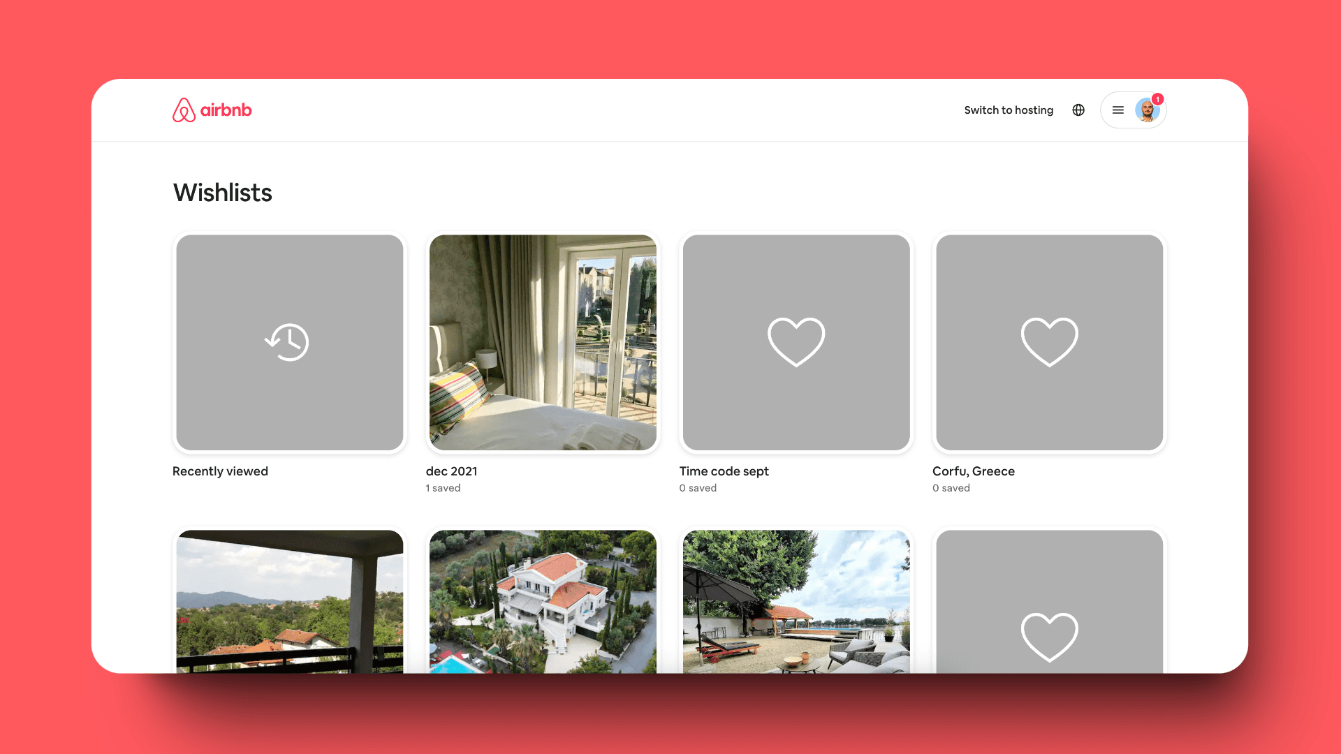
Airbnb continually conducts user testing to refine its interface. This led to the development of features like the "Wish Lists" function, which came directly from user feedback and testing.
Implementation tips:
Start testing early and test often
Use a mix of quantitative and qualitative testing methods
Test with a diverse group of users that represents your target audience
Act on the insights gained from testing
Regular user testing helps ensure your interface meets user needs and expectations, leading to higher satisfaction and engagement.
Conclusion: Mastering UI Design Techniques for Better User Experiences
Effective user interface design is a complex and ongoing process. By following these best practices and implementing key UI design techniques, designers can create interfaces that are not only visually appealing but also highly functional and user-friendly.
Remember, great UI design is about more than just aesthetics. It's about creating experiences that are intuitive, efficient, and enjoyable for users. By putting these UI design tips and techniques into action, you'll be well on your way to designing interfaces that truly resonate with your users and drive the success of your digital products.
As the digital landscape continues to evolve, staying updated with the latest UI design trends and continuously refining your approach based on user feedback and technological advancements will be key to creating exceptional user interfaces. Keep learning, keep iterating, and always put the user at the center of your design process.


